Canada Post
My role: Design Director, corporate lead for brand and design. Led the internal design team of 16 and partnered with an external brand agency through the repositioning. 5 years.
Situation
Canada Post was modernizing its services and redefining its mission: "A Stronger Canada – Delivered." The brand had decades of earned trust and recognition. The job was to evolve it without spending any of that down.
The Challenge
Internally we called it a responsible evolution. Change too much and you break recognition that took generations to build. Change too little and the brand can't carry the new mission. And the audience wasn't one audience: the rollout had to land with three unions, thousands of front-line employees, and millions of Canadians at the same time, with marketing, communications, and operations all moving in step.
What I did
The core identity was developed in partnership with an external brand agency. My job was leading the internal side of that partnership: shaping the system with them, pressure-testing it against the realities of the organization, and then making it stick.
That second part is the part nobody sees. An agency can design a beautiful system. It only becomes a brand when three unions, thousands of front-line employees, and dozens of internal teams actually use it, correctly, without a designer in the room. That was mine to solve.
So the rollout was designed like a product launch, not a reveal. National leadership events. Employee kits delivered to homes. Workbooks that helped teams understand where the company was going before the public saw anything. Coordination with three unions. Then the full suite of public-facing material.
Typography
Canadiana
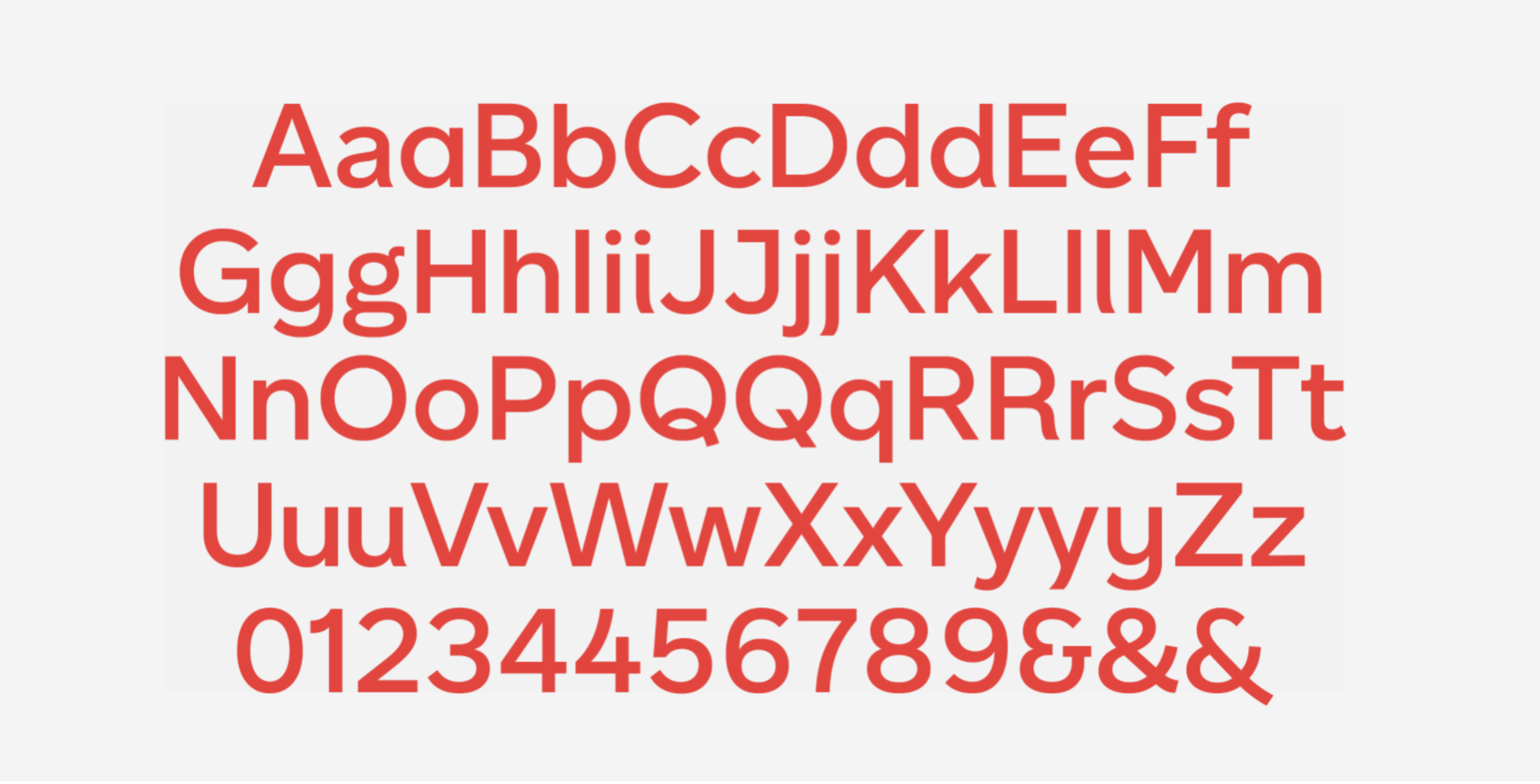
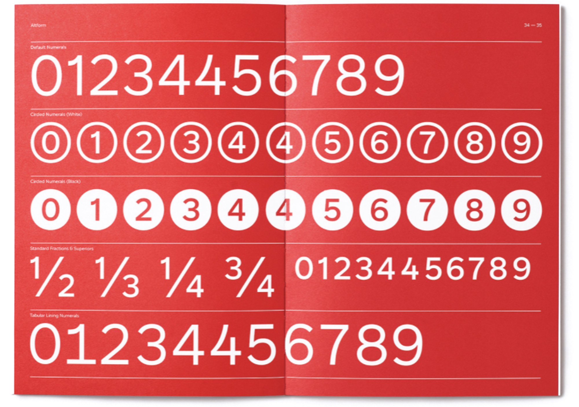
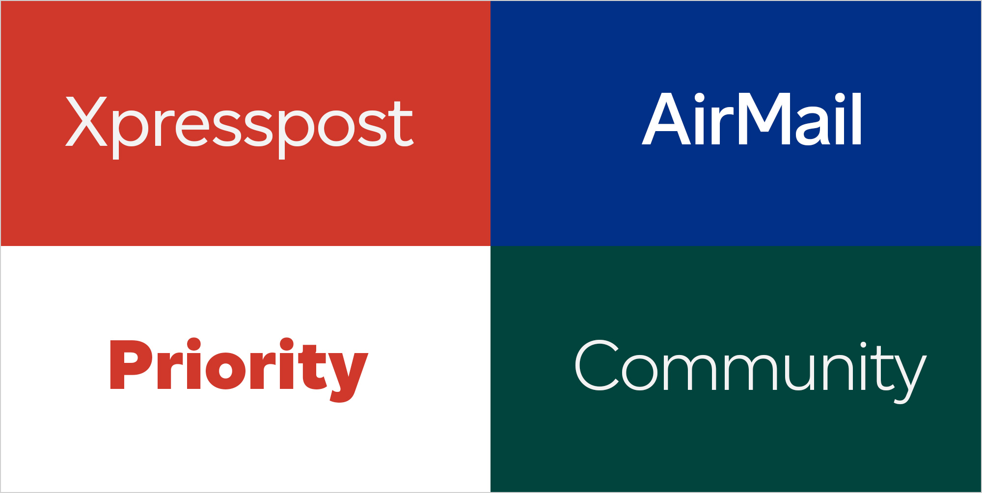
As part of the repositioning, the brand got its own typeface. Canadiana is a geometric sans serif built specifically for Canada Post: confident, clear, and consistent across digital, print, and motion. It holds up across weights and gives everything the organization produces one voice.
Colour
The palette stays rooted in the colours people already recognize, then extends them: better support for photography, stronger accessibility, more presence across channels. Familiar at a glance, more capable in use.


The system
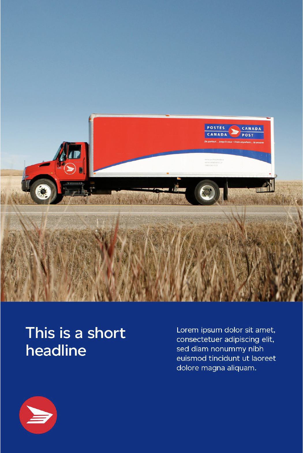
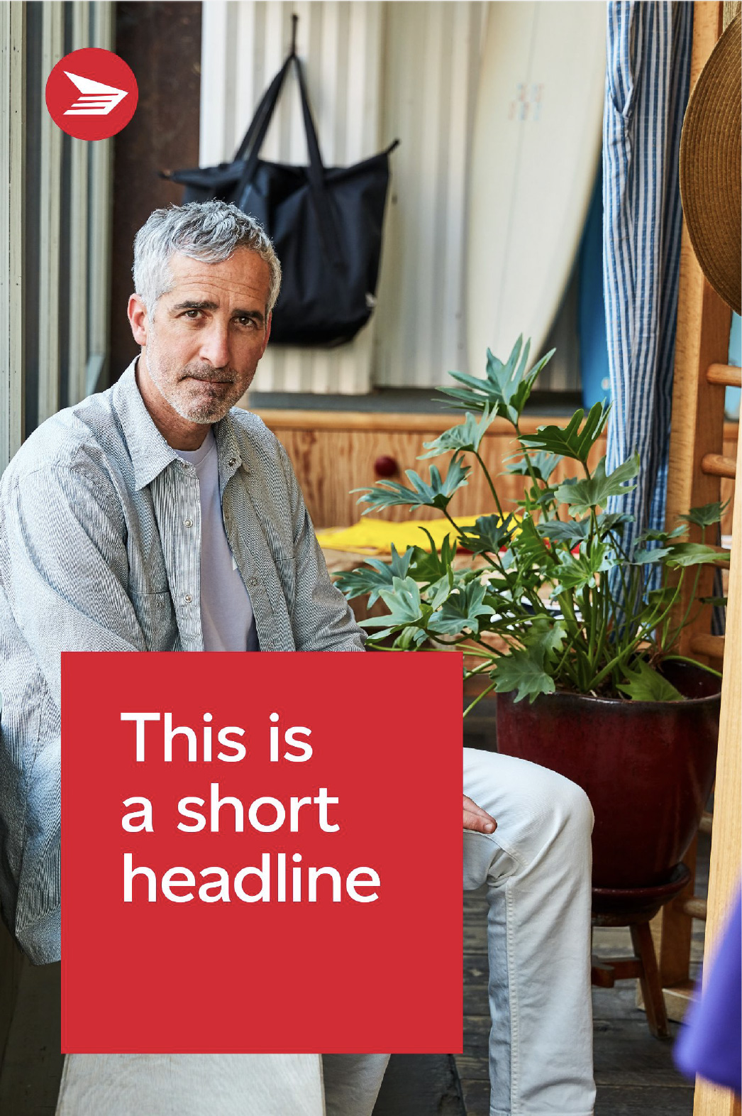
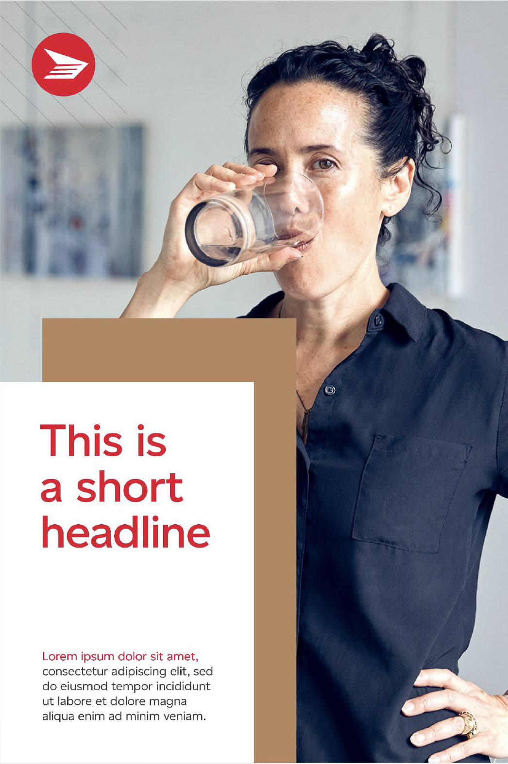
At the core is a flexible grid: five layout structures that give teams across the organization a way to produce work that feels consistent without being rigid.


Out of home
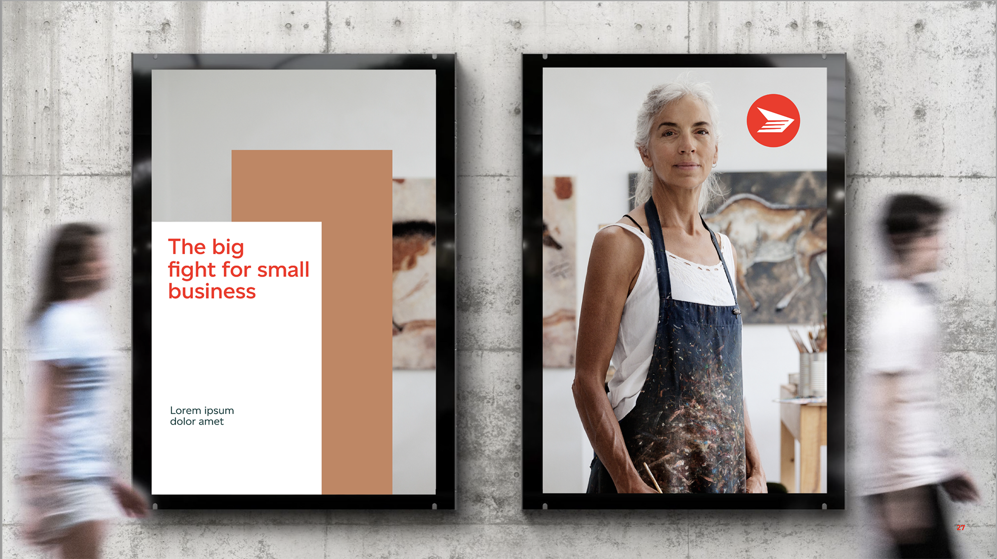
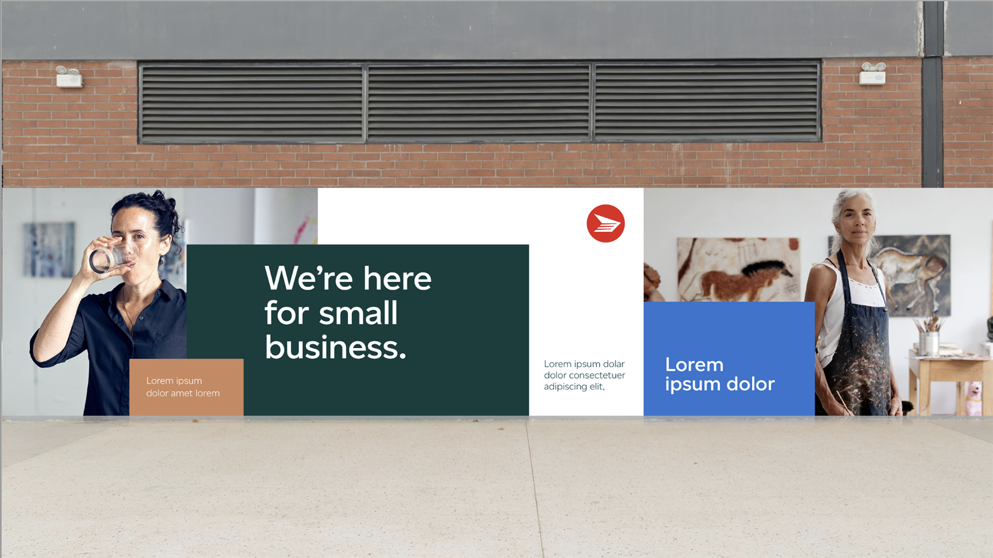
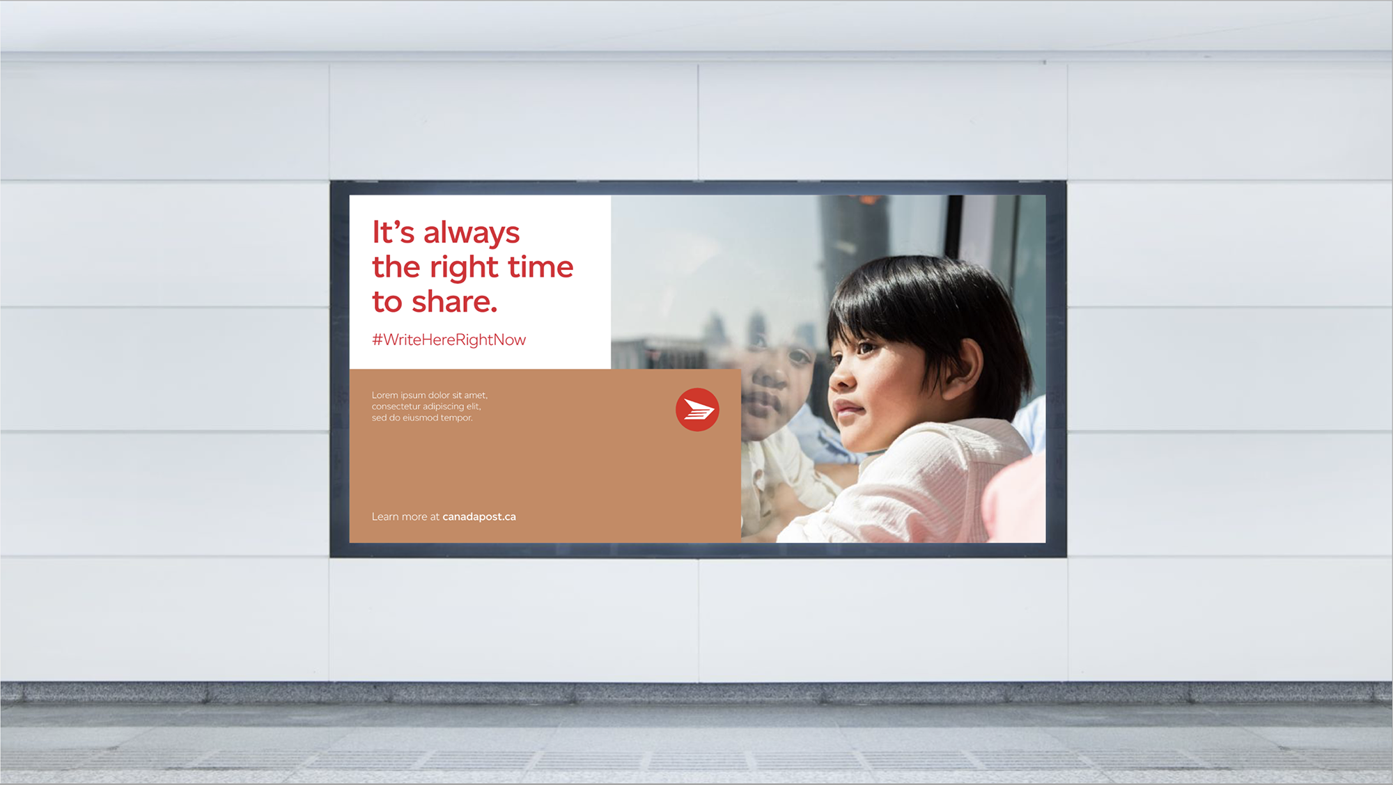
Simple was the goal, and simple is never easy. We distilled the brand to its most essential elements so it could hold up in high-visibility environments. Each piece works alone; together they build a presence you recognize before you've read a word.
Print and beyond
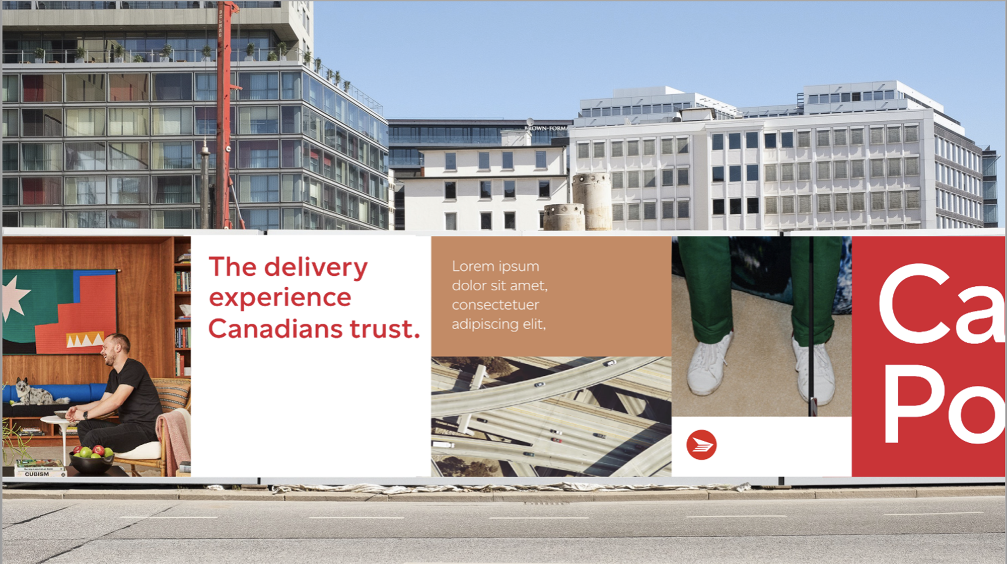
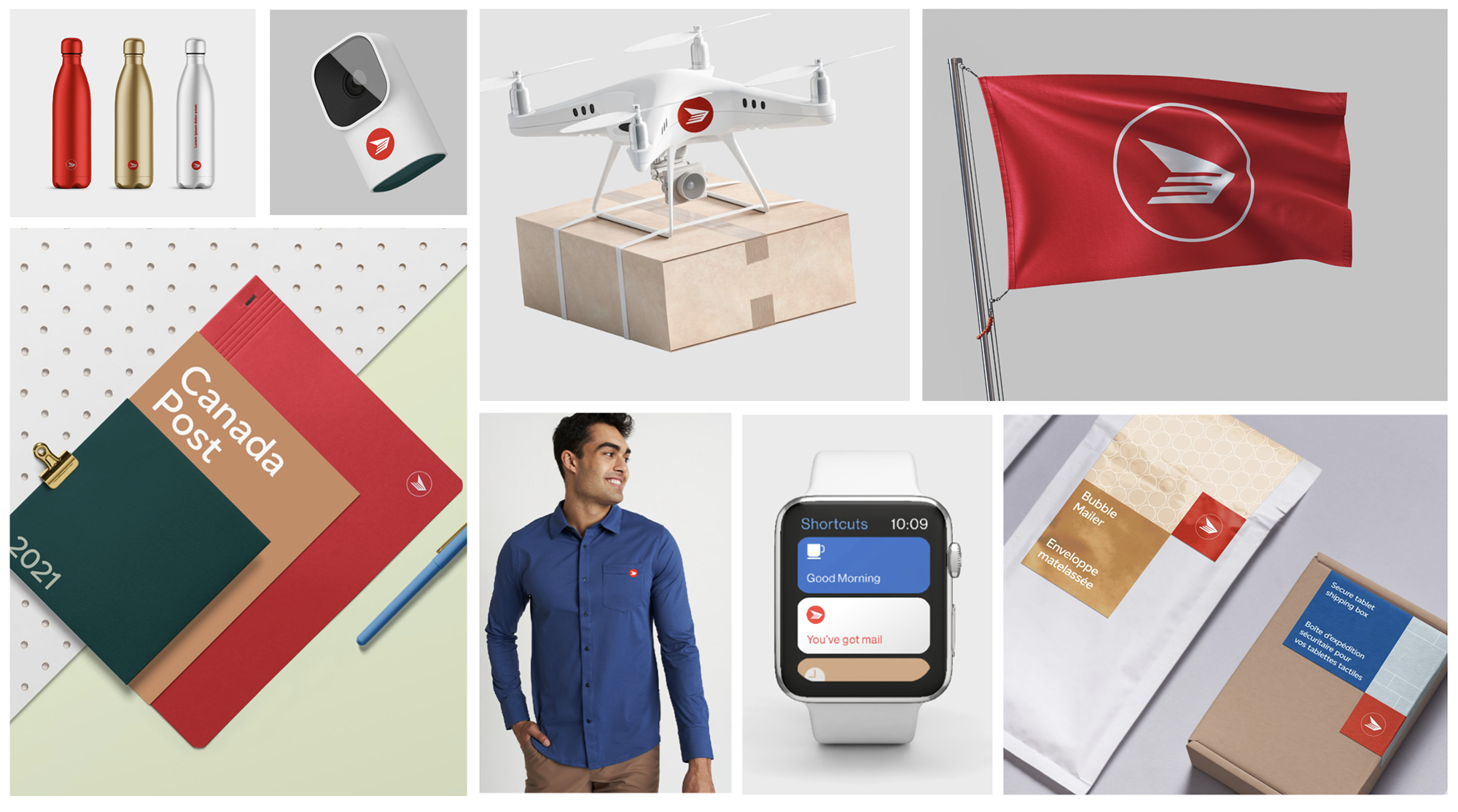
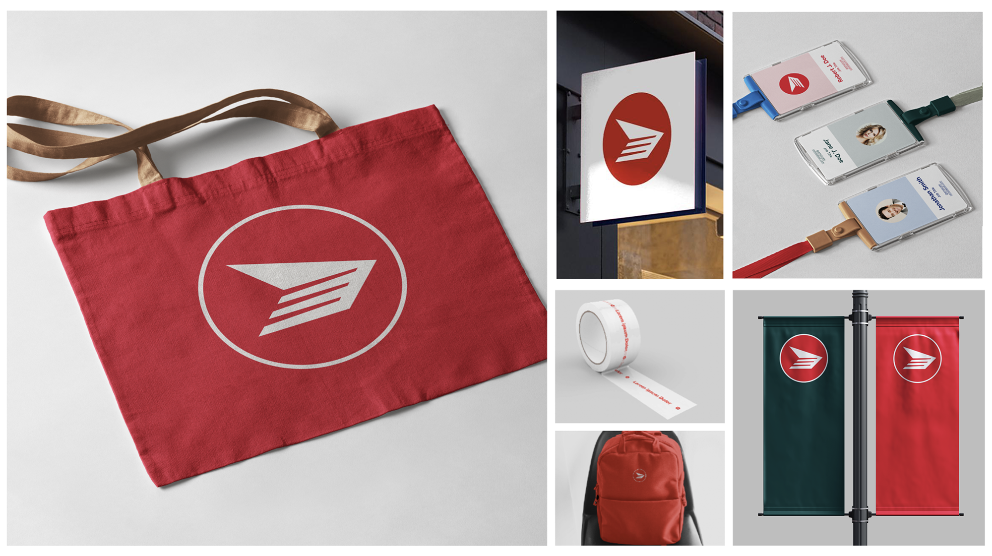
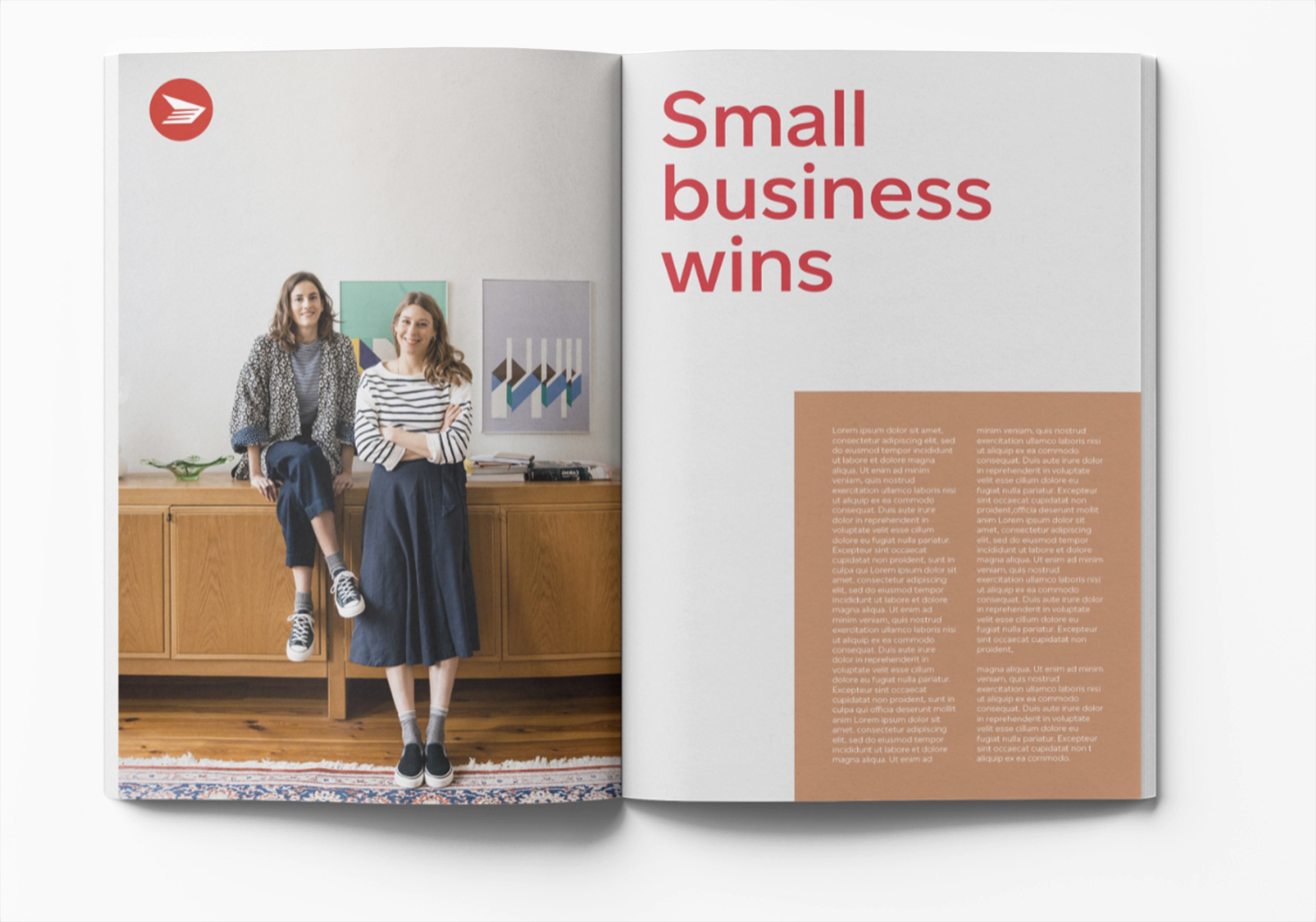
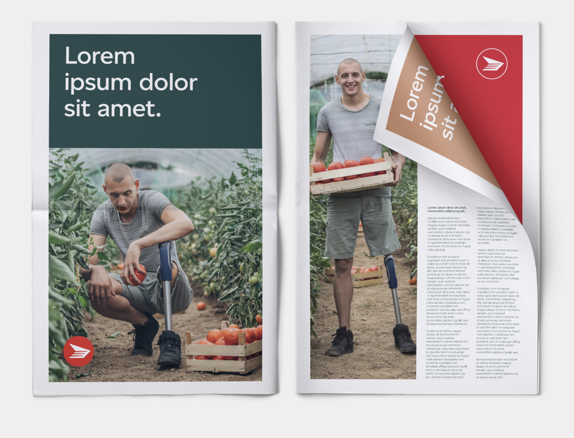
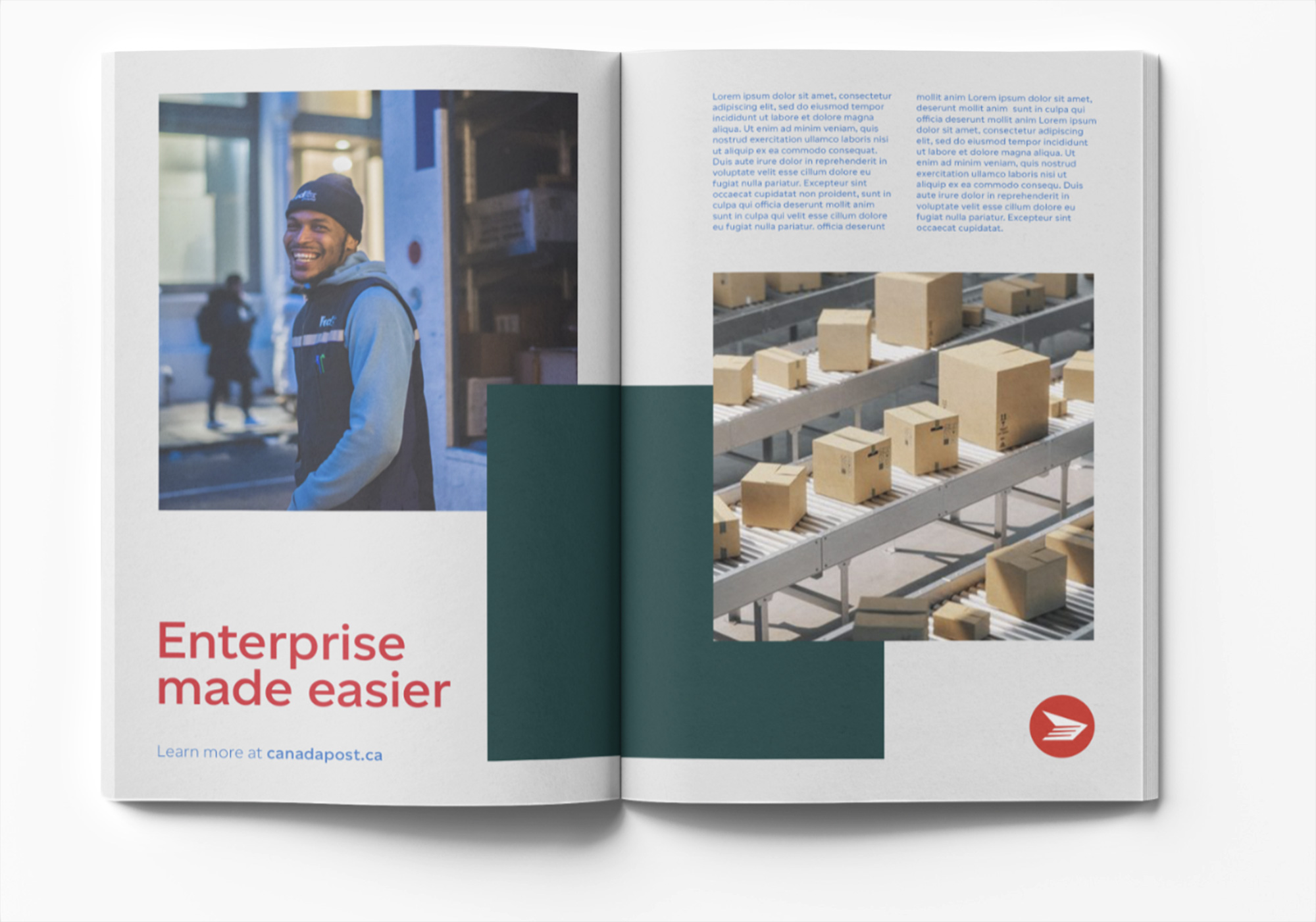
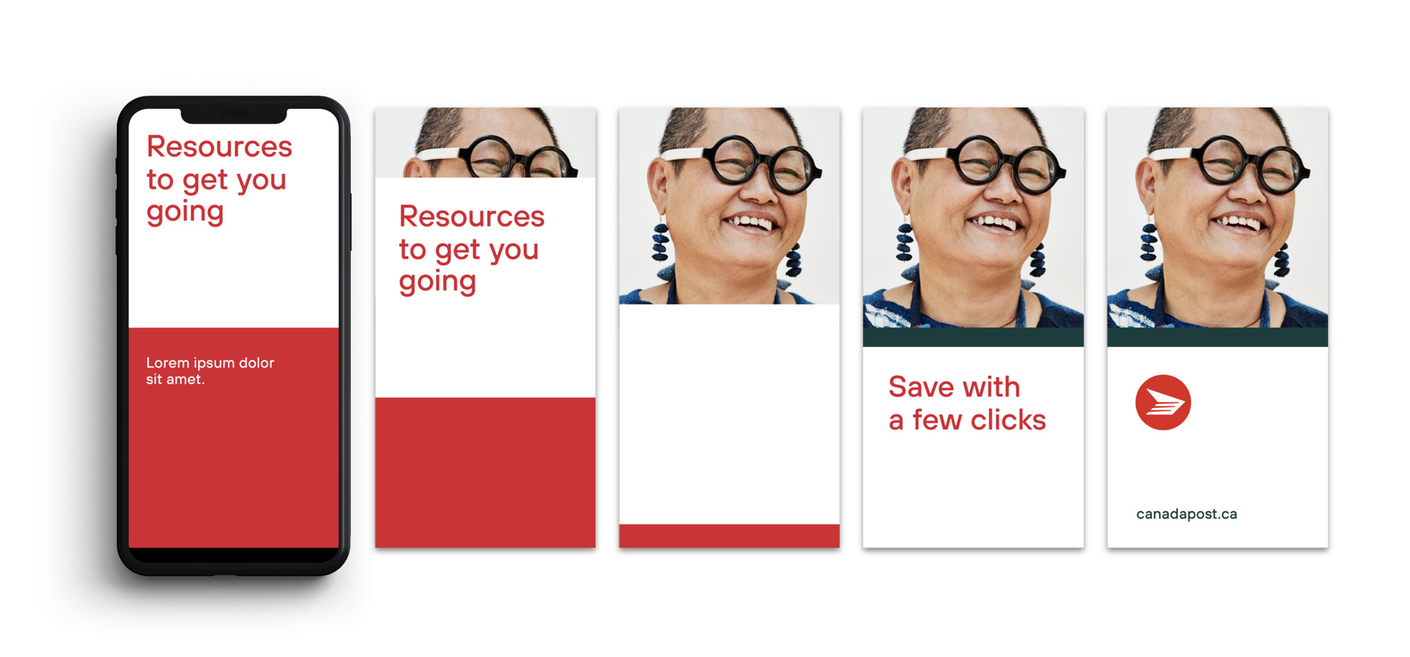
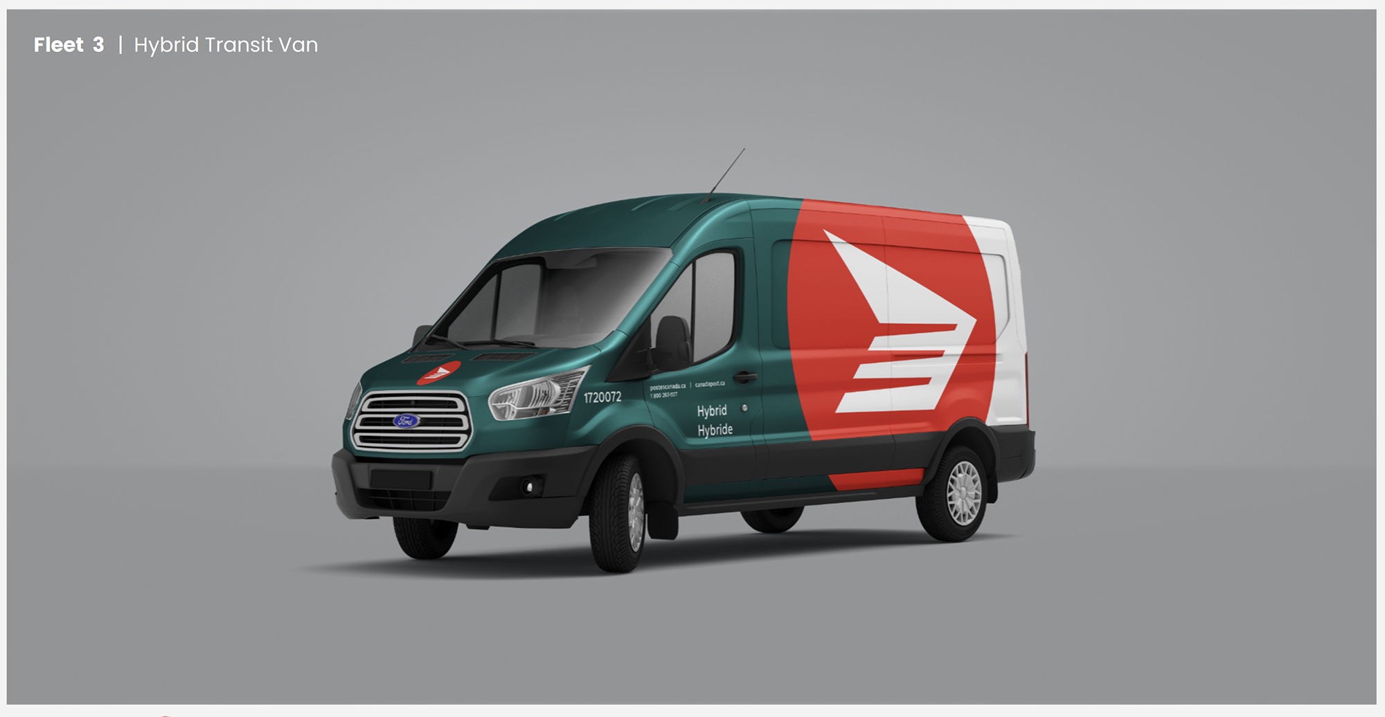
The system was built to work everywhere.
Whether it’s print, video, or social, the visual language adapts naturally without losing consistency. That flexibility helps strengthen the brand across channels and makes it easier for teams to apply it in real situations.
What I learned
A rebrand doesn't succeed at launch. It succeeds months later, when a front-line employee who never met the design team applies it correctly without thinking about it. Everything about this project, the workbooks, the kits, the union coordination, the grid system, was built for that moment rather than for the reveal.