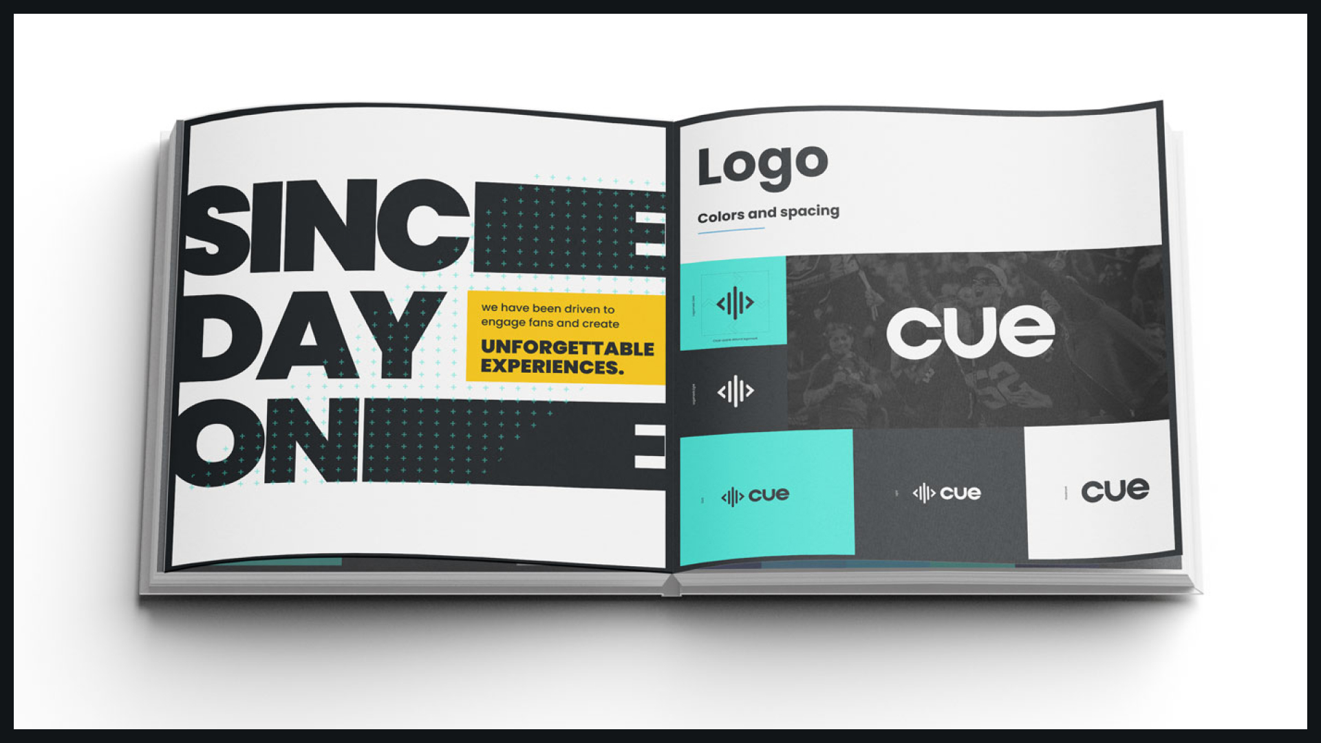
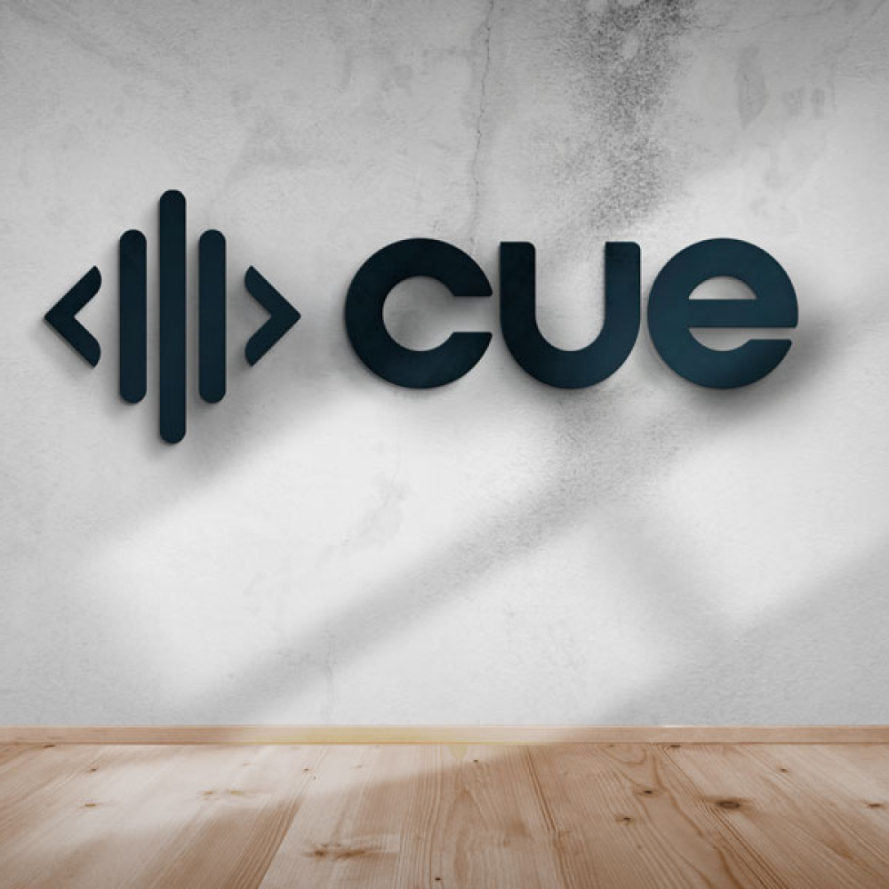
CUE
Situation
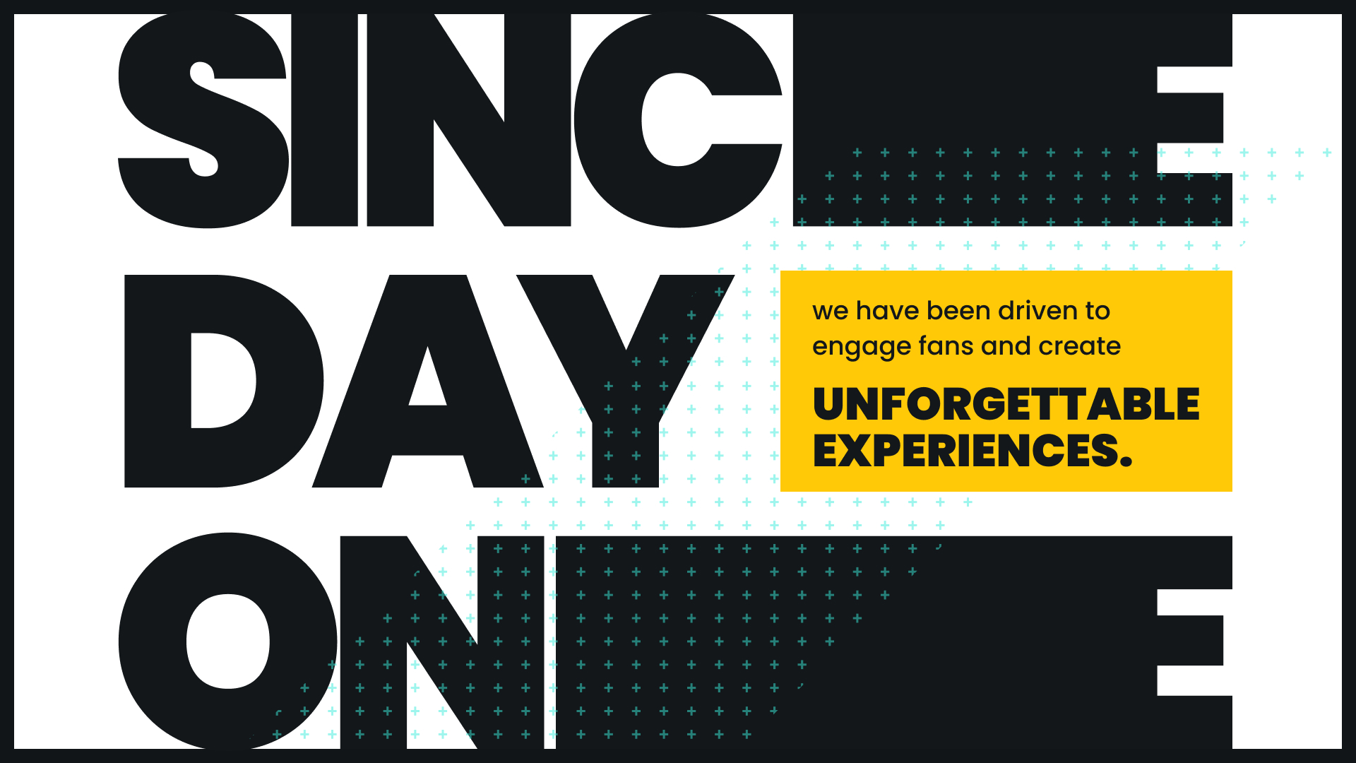
CUE had built strong early recognition, but as the company matured, the brand needed to evolve to reflect a more confident and scalable identity. The goal was to modernize while preserving the equity and familiarity that existing users and partners already trusted.
The Challenge
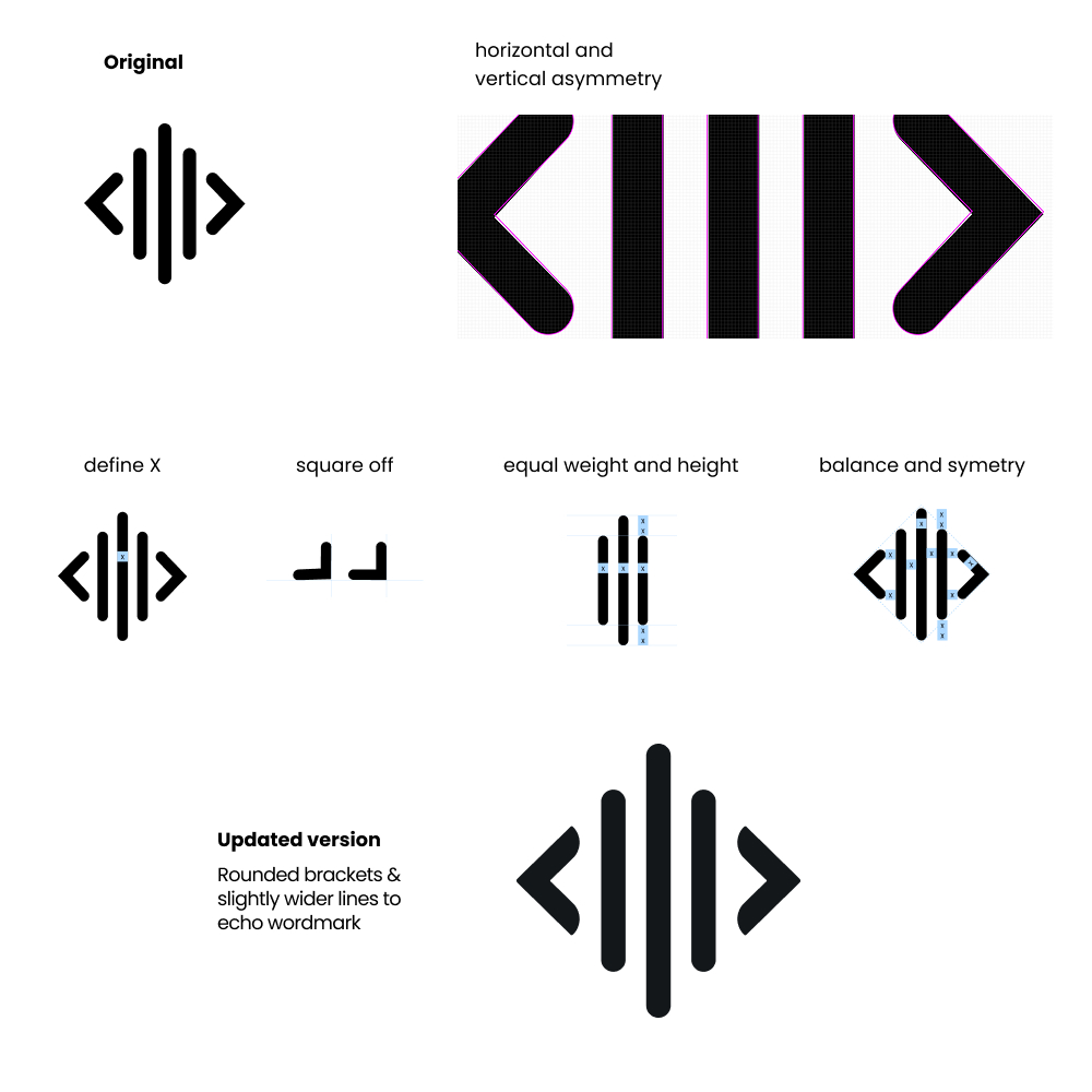
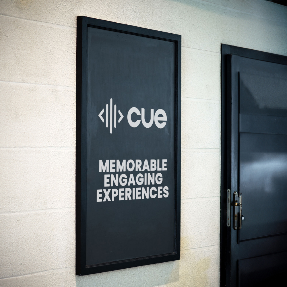
The work required careful restraint. Change too much and you risk losing recognition; change too little and the brand couldn’t scale across new applications, from marketing and partnerships to live experiences. The system needed to support multiple touchpoints, maintain clarity, and remain consistent across teams.
What Was Done
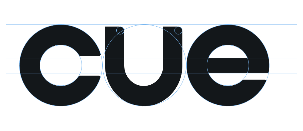
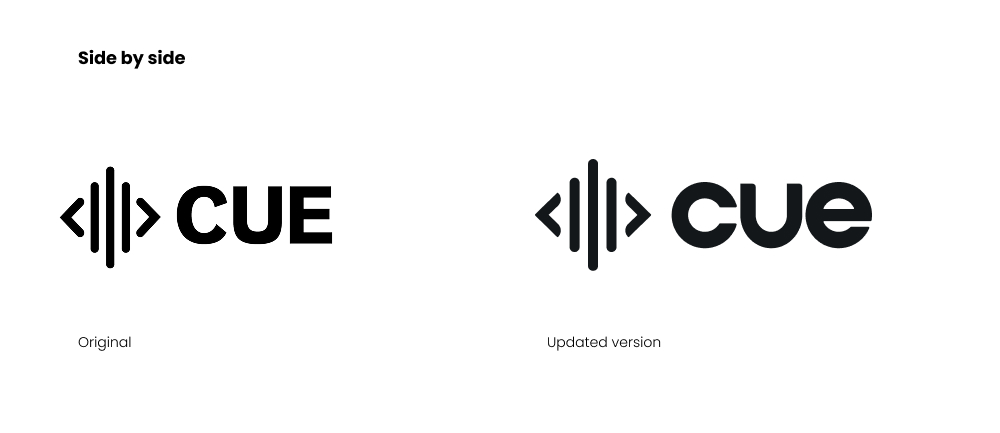
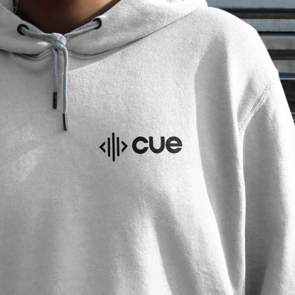
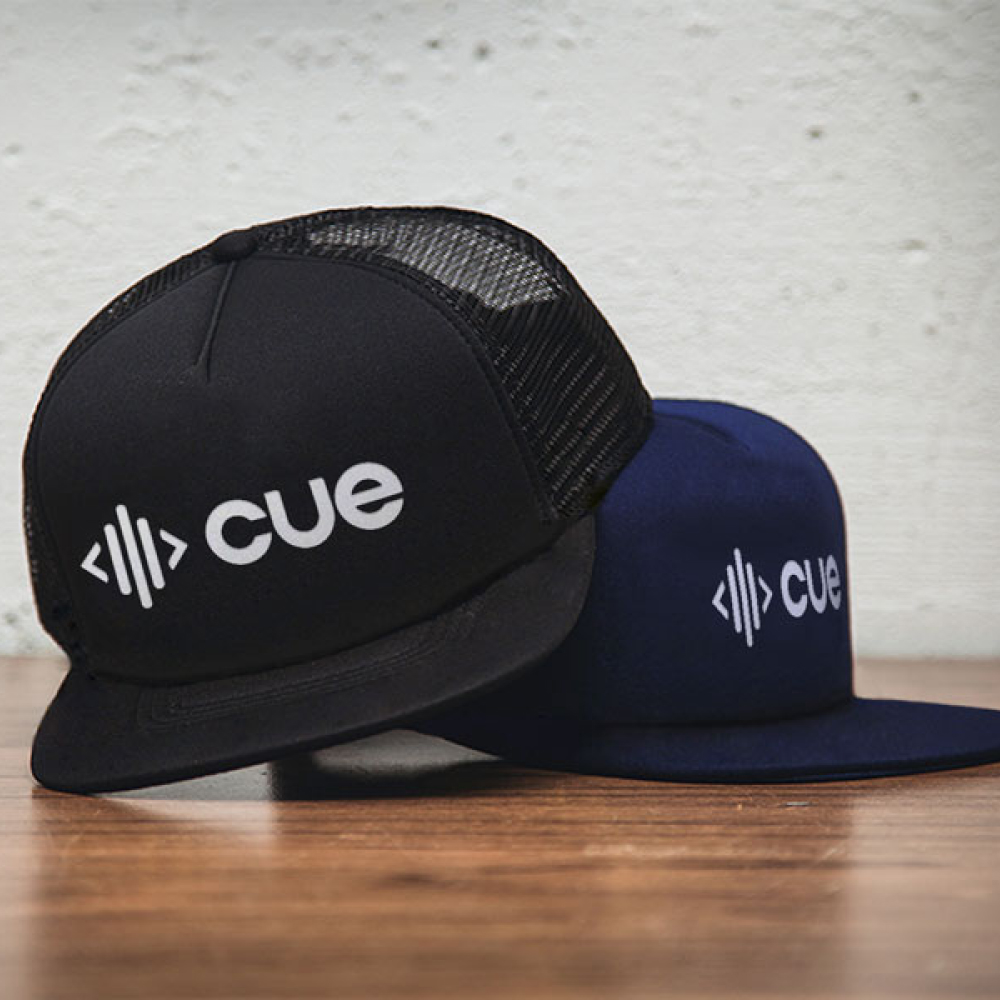
I led the evolution of the brand by refining its core visual language, strengthening typography, balancing color systems, and clarifying visual hierarchy. Guidelines and frameworks were created to ensure consistent application across all touchpoints, enabling teams to execute confidently while keeping the brand recognizable. The result is a more mature, flexible, and cohesive identity, positioning CUE for its next stage of growth.