Canada Post
Situation
Canada Post was modernizing its services and redefining its mission with “A Stronger Canada – Delivered.” The brand needed to evolve thoughtfully, maintaining the trust and recognition it had earned while expressing renewed purpose.
The Challenge
The work required a “responsible evolution.” The challenge was to improve clarity, usability, and cohesion across a complex ecosystem without disrupting existing recognition. The rollout needed to land across multiple audiences, including internal teams, unionized front-line employees, and millions of Canadians, while aligning marketing, communications, and operations.
What Was Done
I was the corporate lead for brand and design, responsible for guiding the evolution of the visual system and ensuring alignment across the organization. I helped translate the new mission into a cohesive and scalable brand, supporting consistency across digital, print, and motion.
The rollout was thoughtfully orchestrated, including national leadership events, employee kits delivered to homes, workbooks to help teams understand the company’s direction, and coordination with three unions. This was supported by a full suite of public-facing materials to ensure clarity and consistency for Canadians.
The result is a brand that feels purposeful and unified, supporting internal alignment and connecting more clearly with the public.
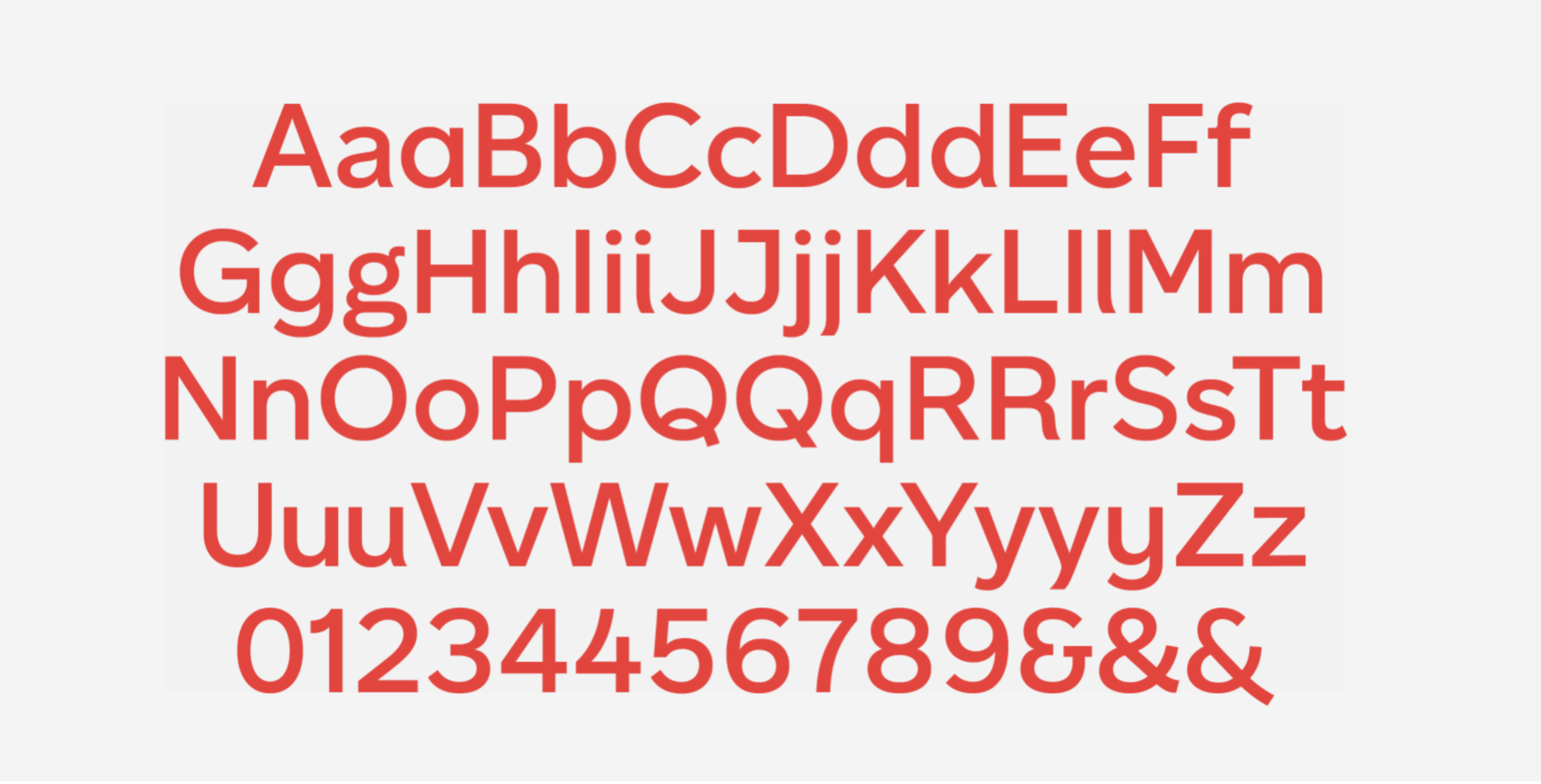
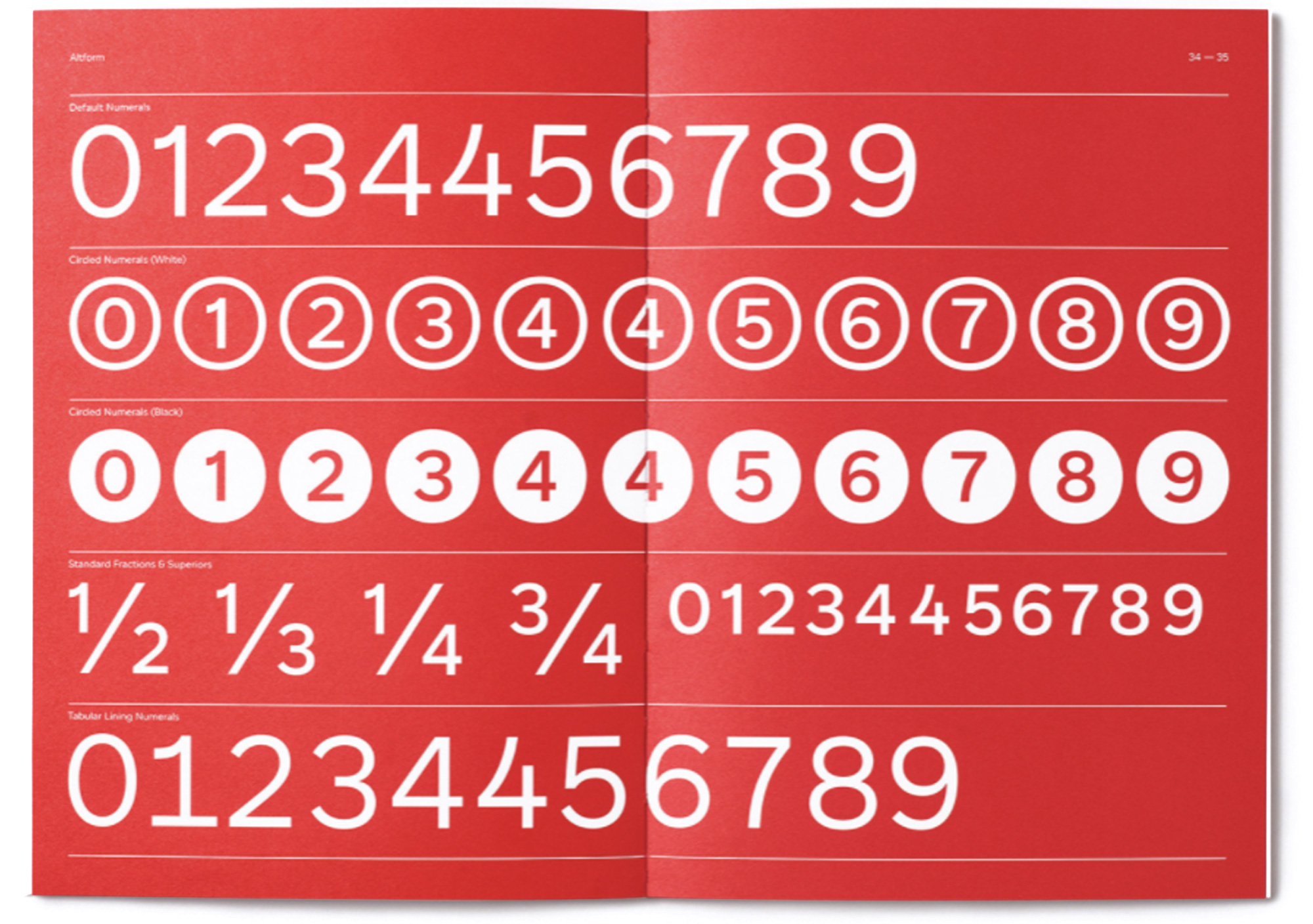
Typography
Canadiana
We introduced a bespoke typeface built specifically for the brand. Canadiana is a modern, geometric sans serif designed to feel confident and clear, while working consistently across digital, print, and motion. It scales well, holds up across weights, and brings a more cohesive voice to everything we produce.
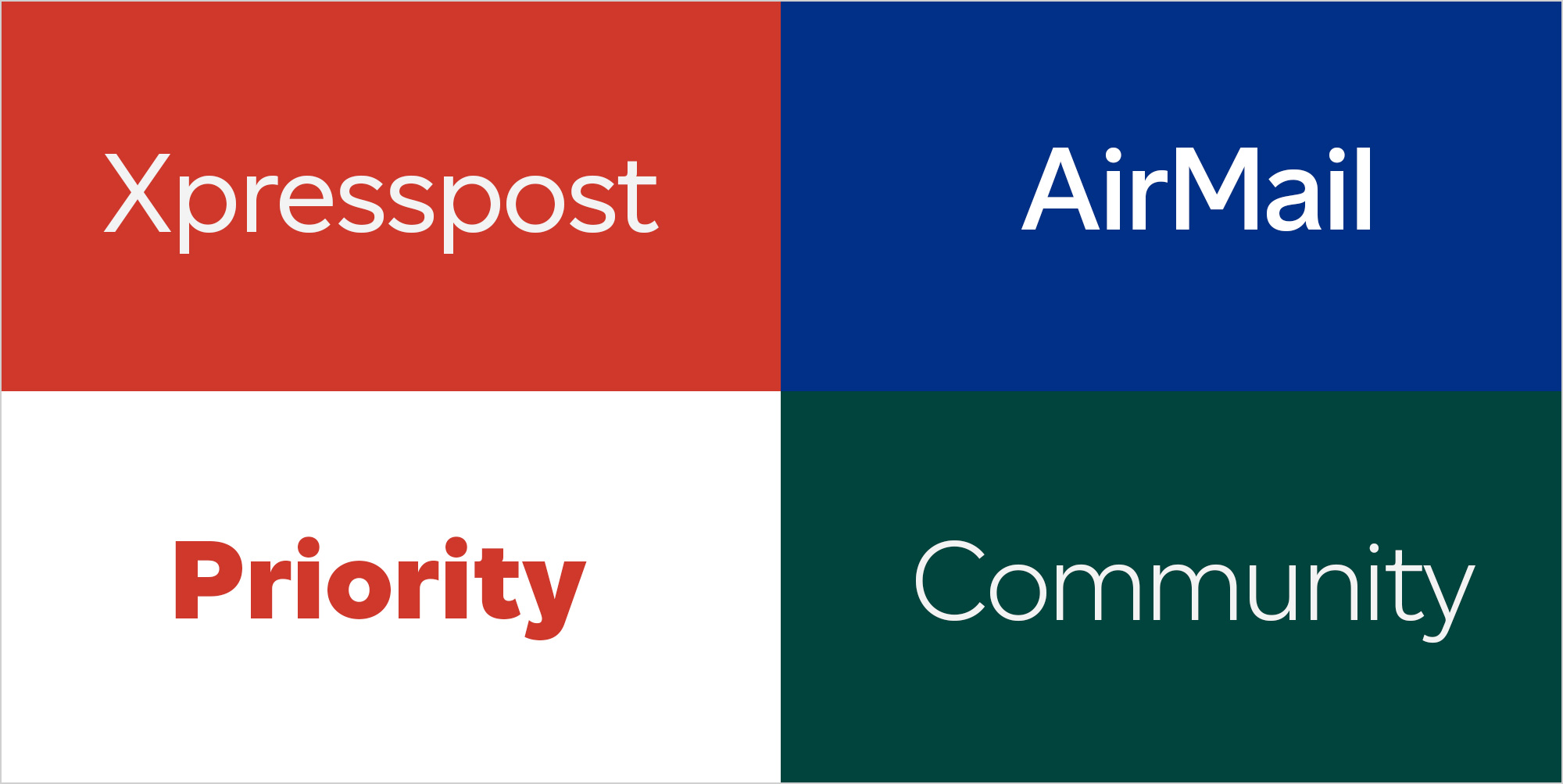
Colour
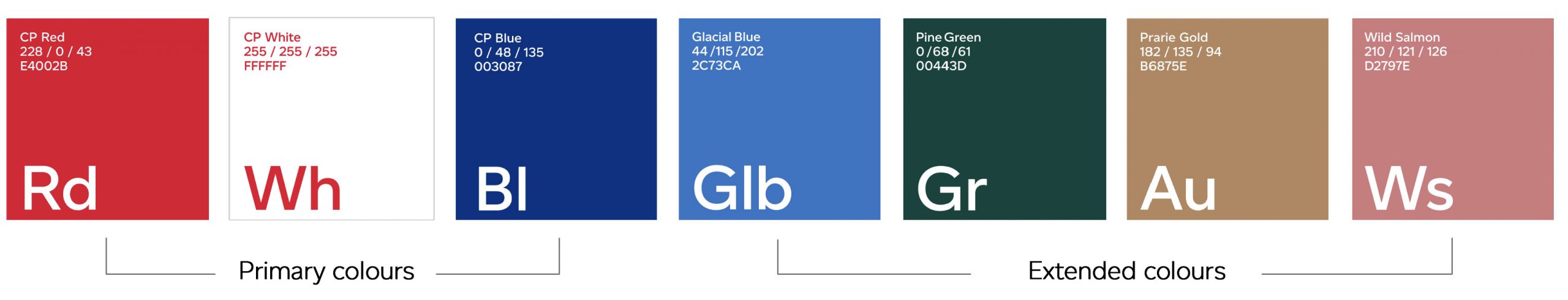
The colour system builds on what people already recognize, while giving us more range and flexibility.
We expanded the palette to better support photography, improve accessibility, and create stronger presence across channels. It stays rooted in the legacy colours but performs much better in real-world use.

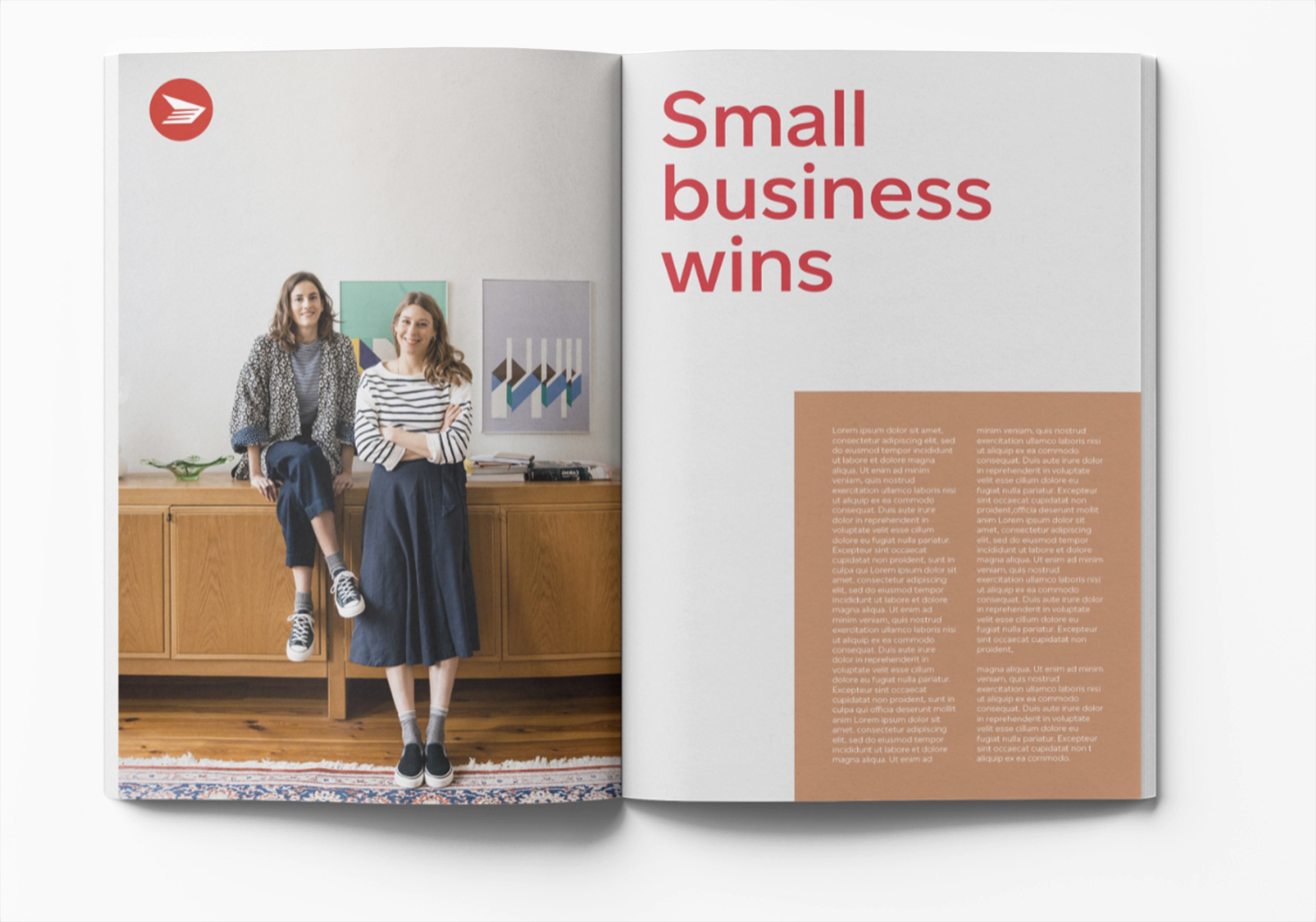
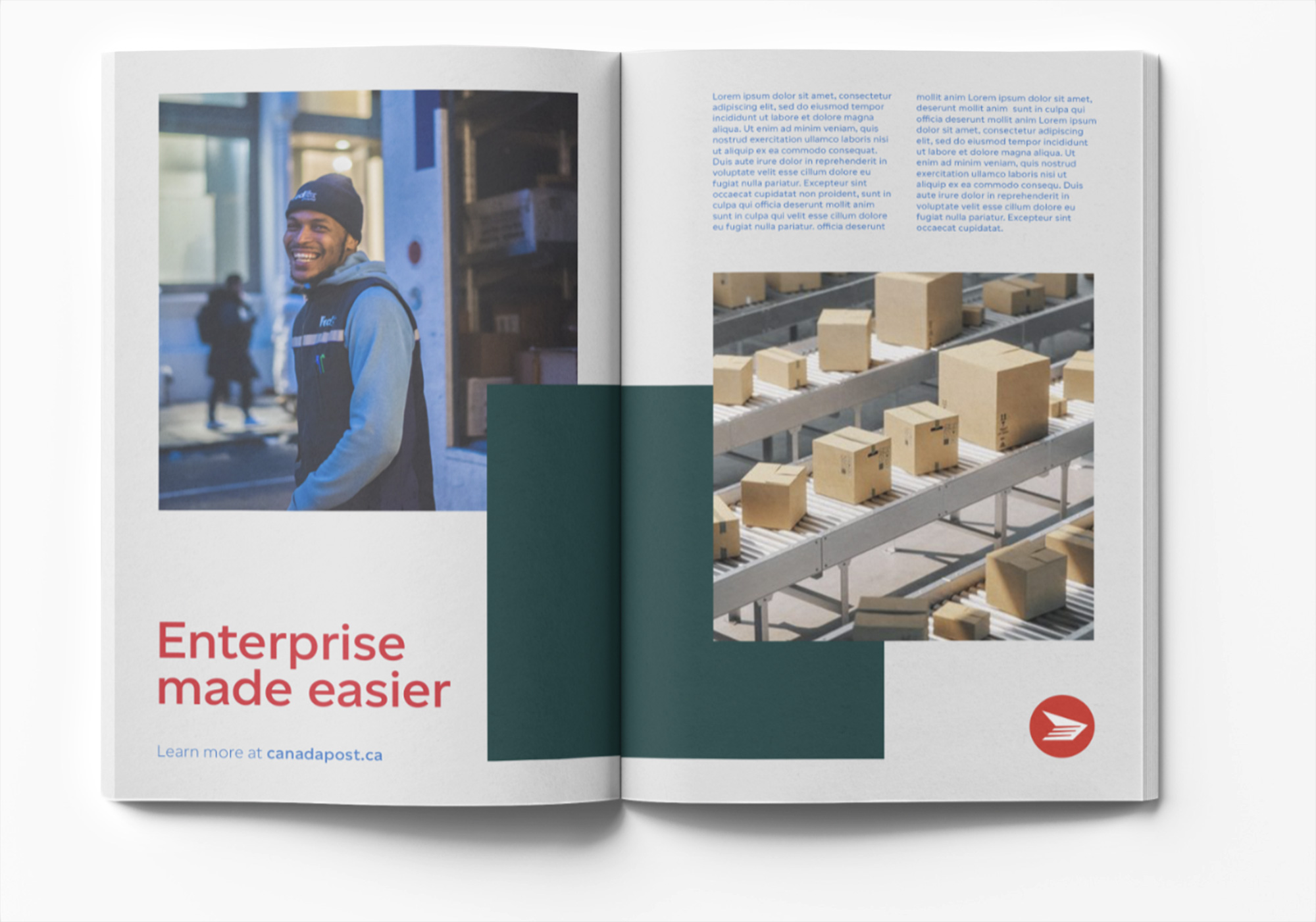
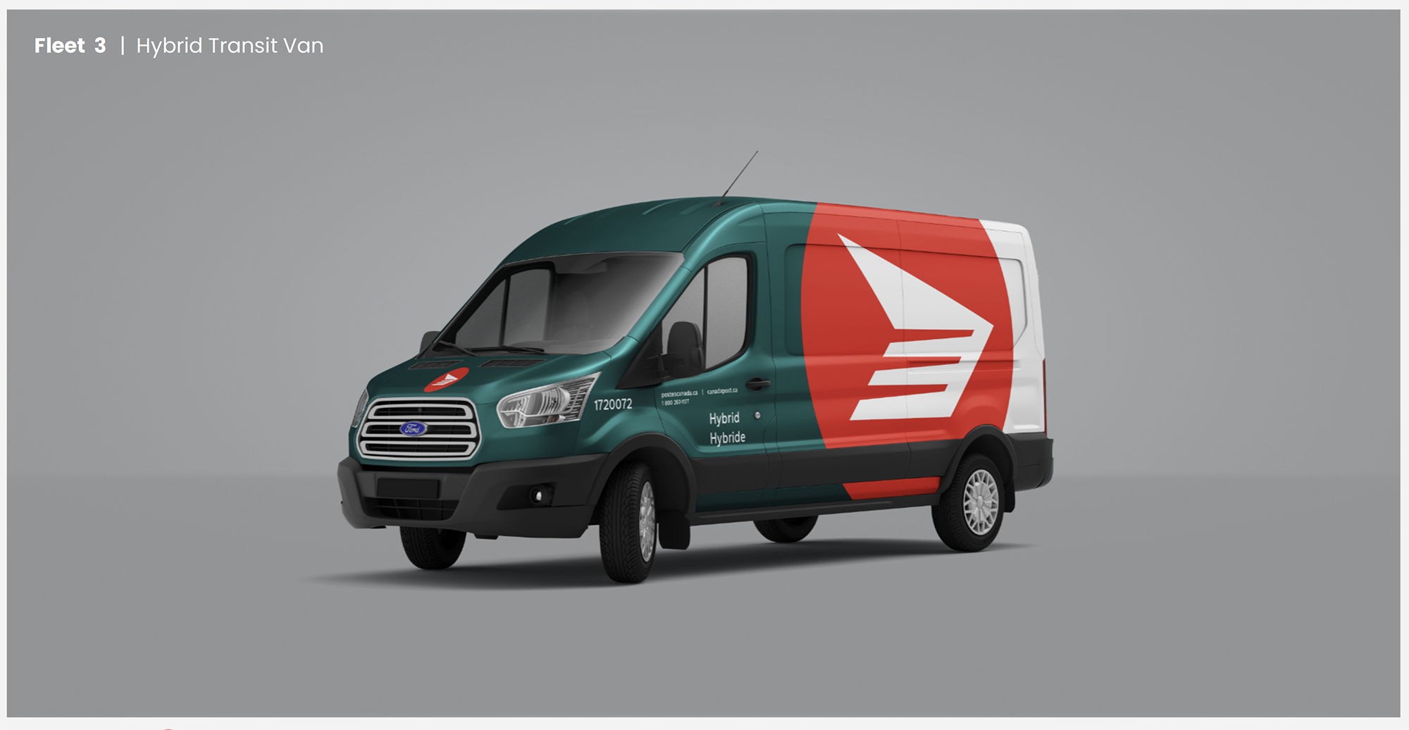
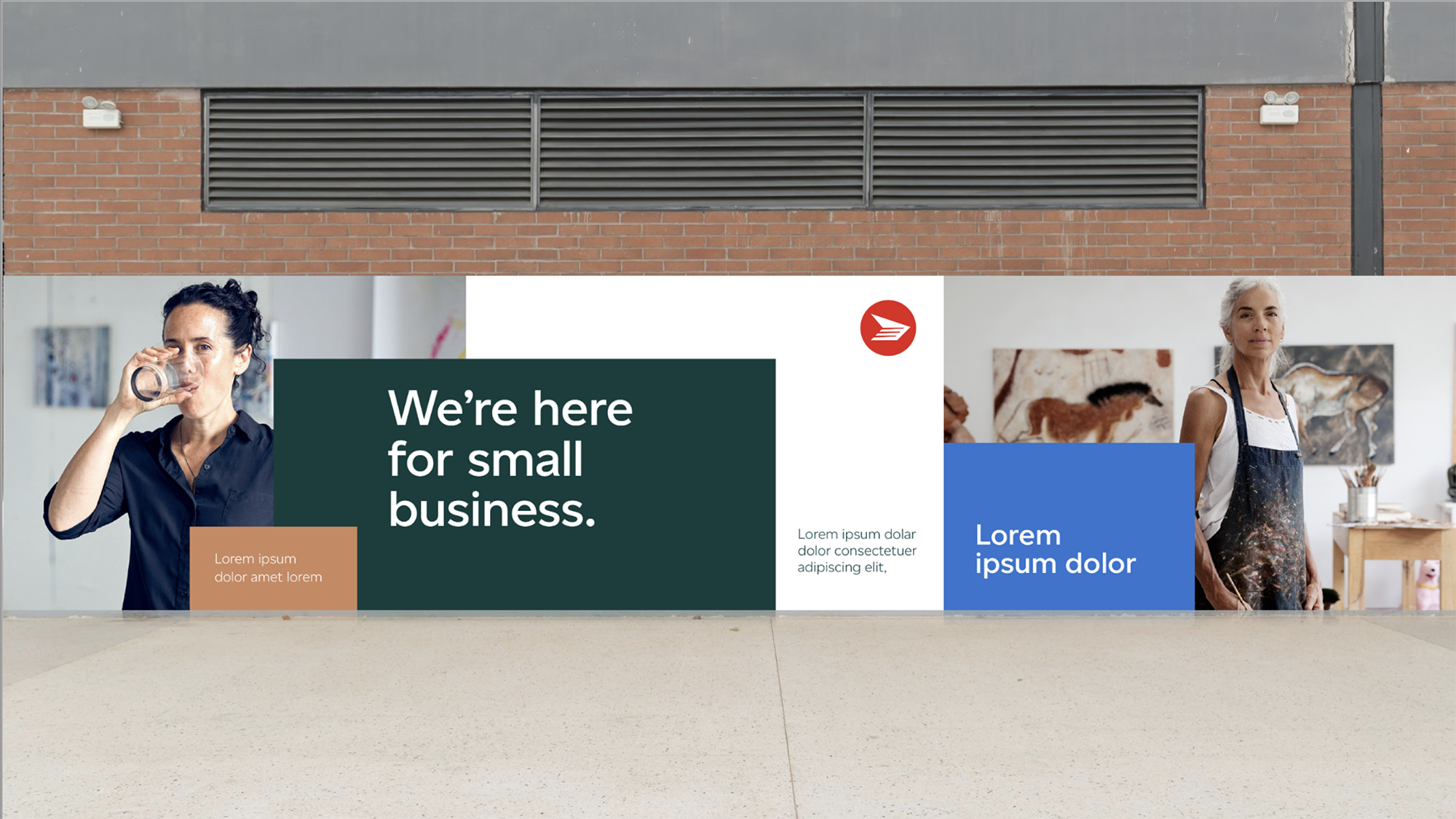
Design
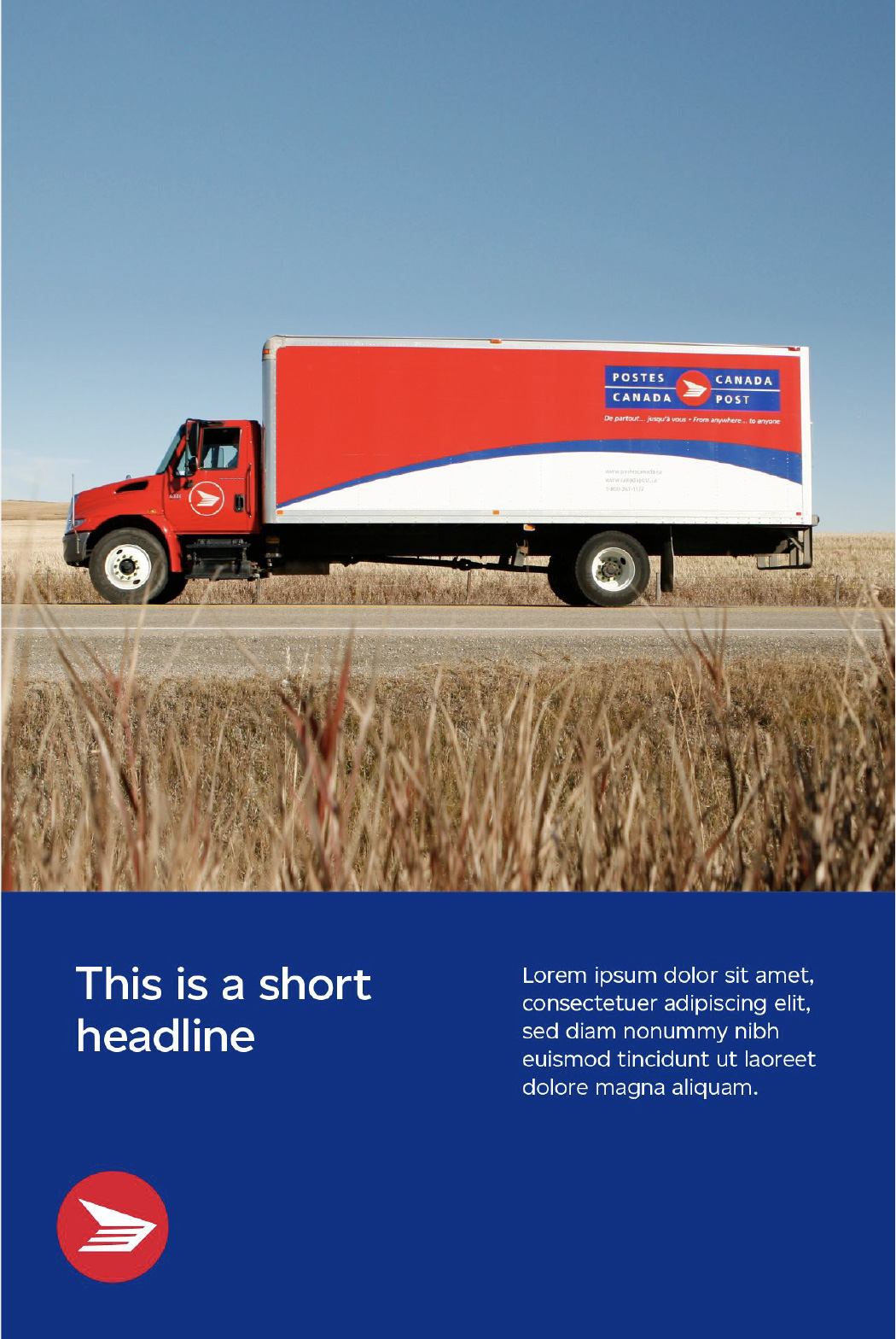
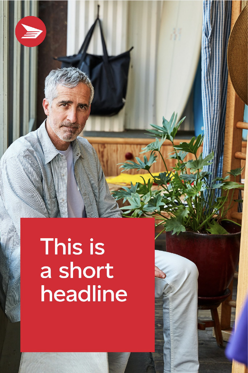
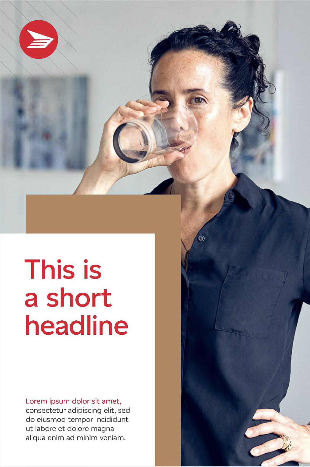
We developed a unified visual system to support the brand across all touchpoints.
At the core is a flexible grid that brings structure and consistency, while still allowing for variation. The system prioritizes imagery and clarity, helping teams create work that feels consistent without being rigid.


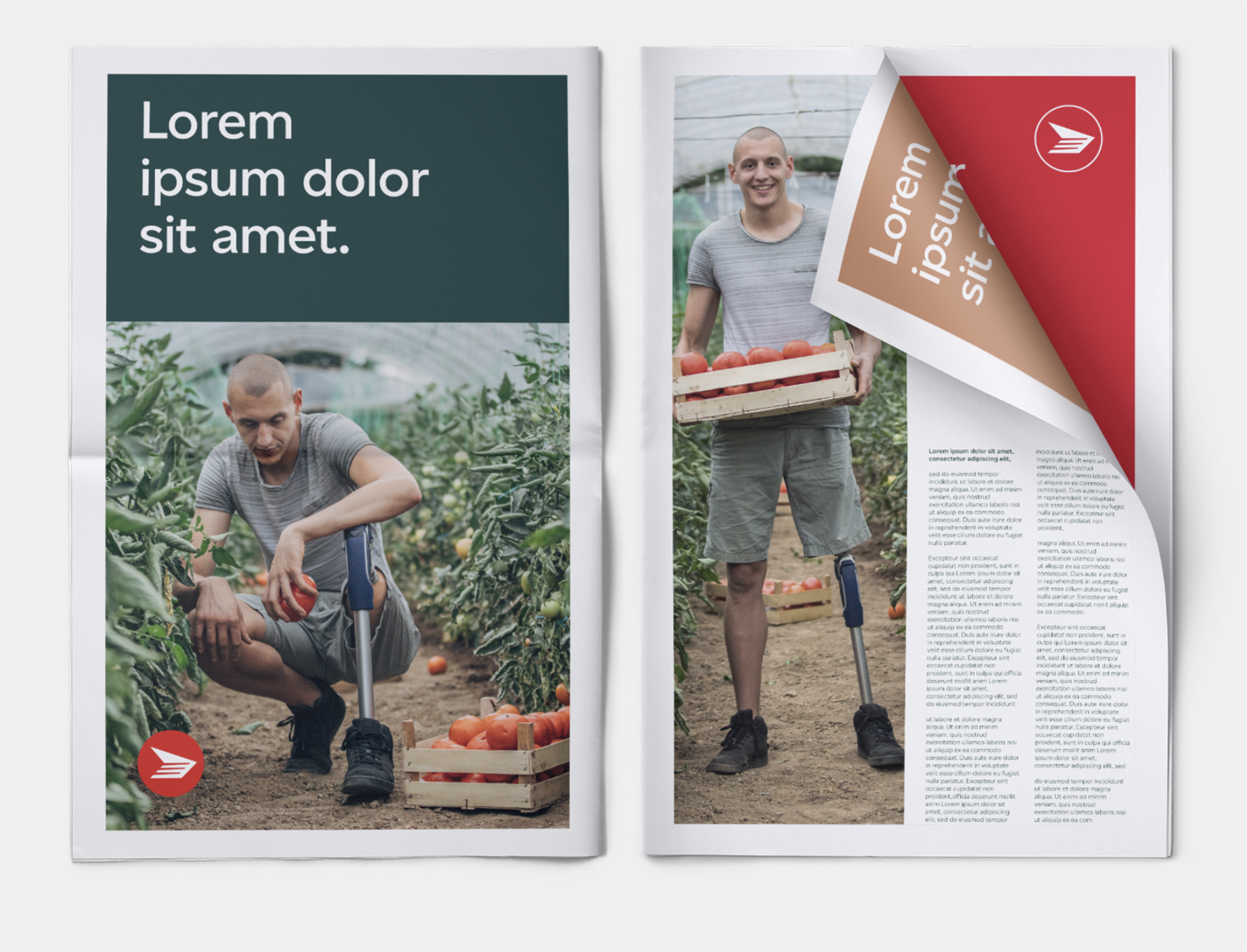
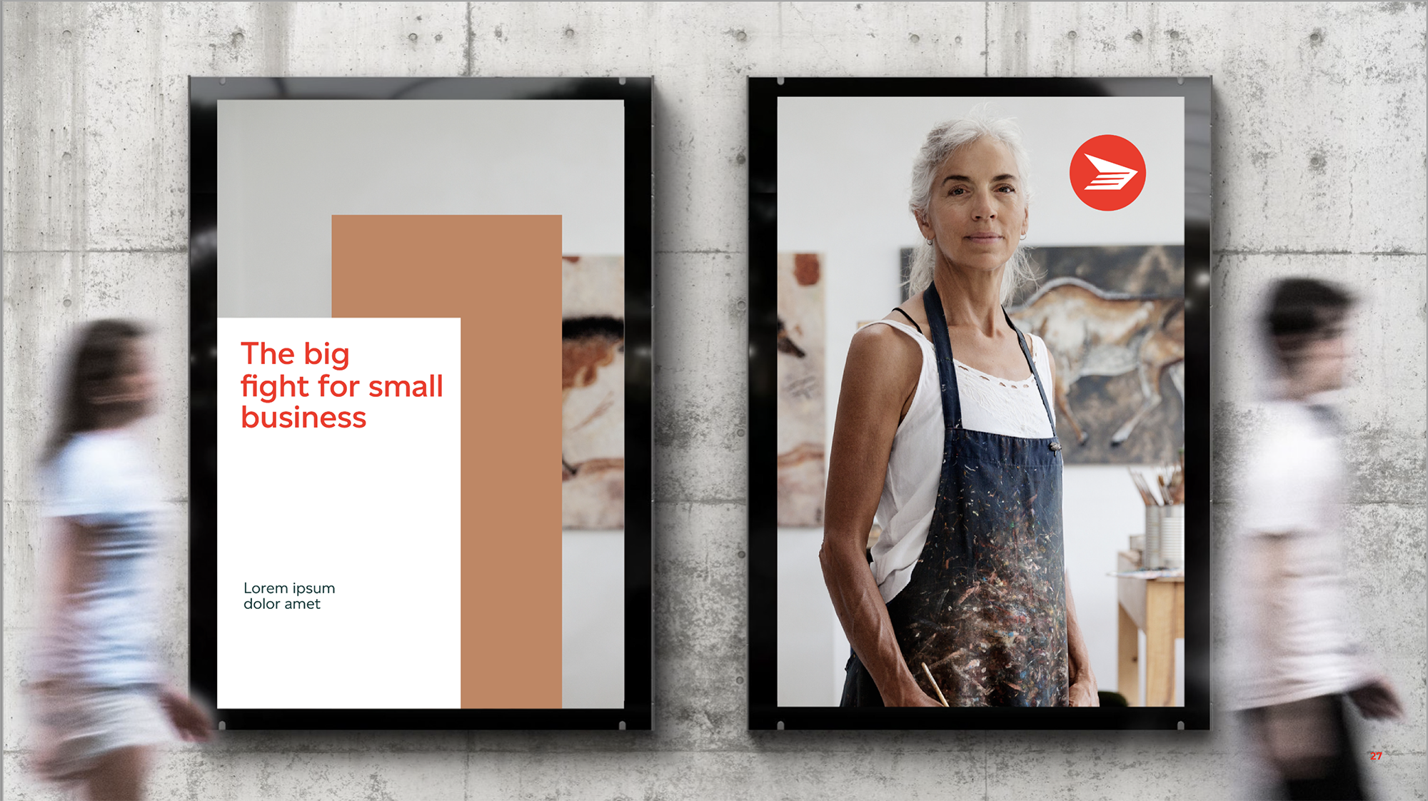
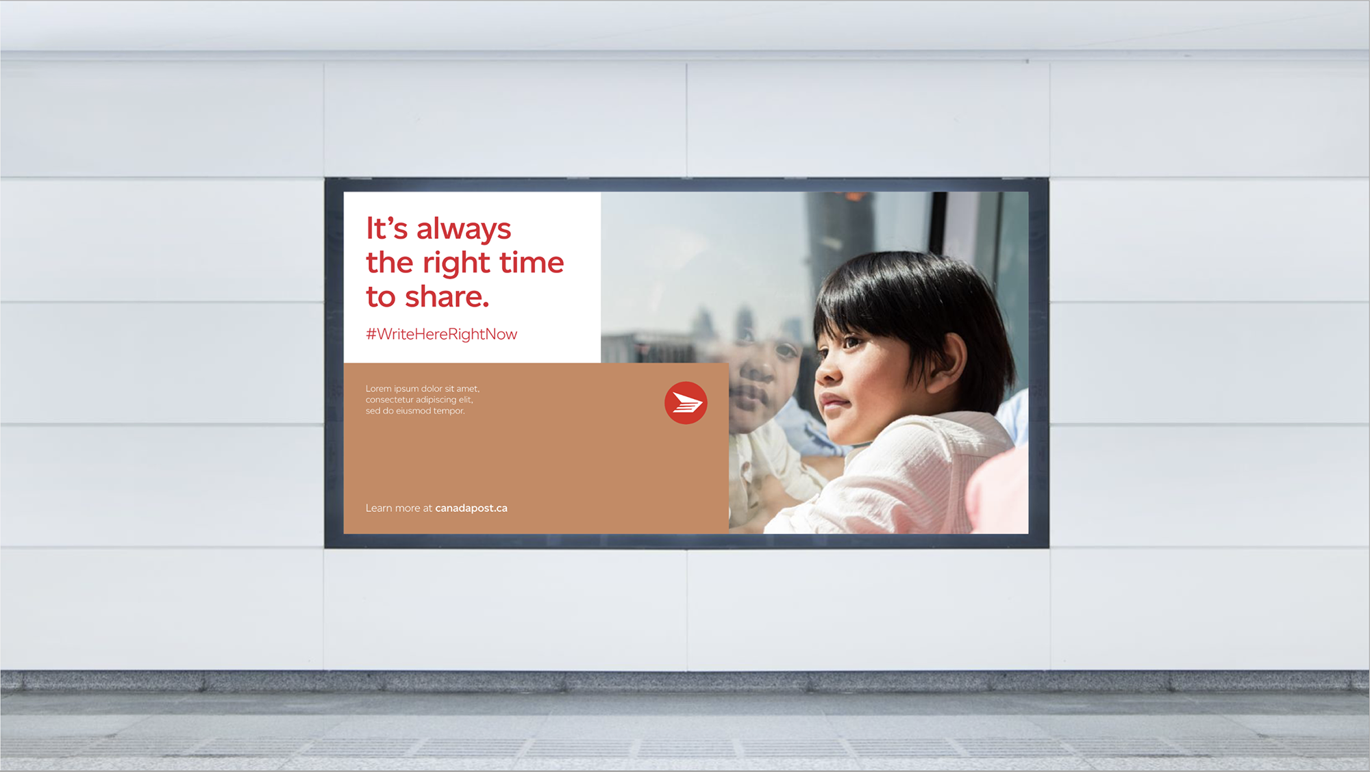
Out-of-home advertizing
Simple was the goal, but not easy to get to.
We focused on distilling the brand down to its most essential elements so it could hold up in high-visibility environments. Each piece works on its own, but together they build a clear and recognizable presence.
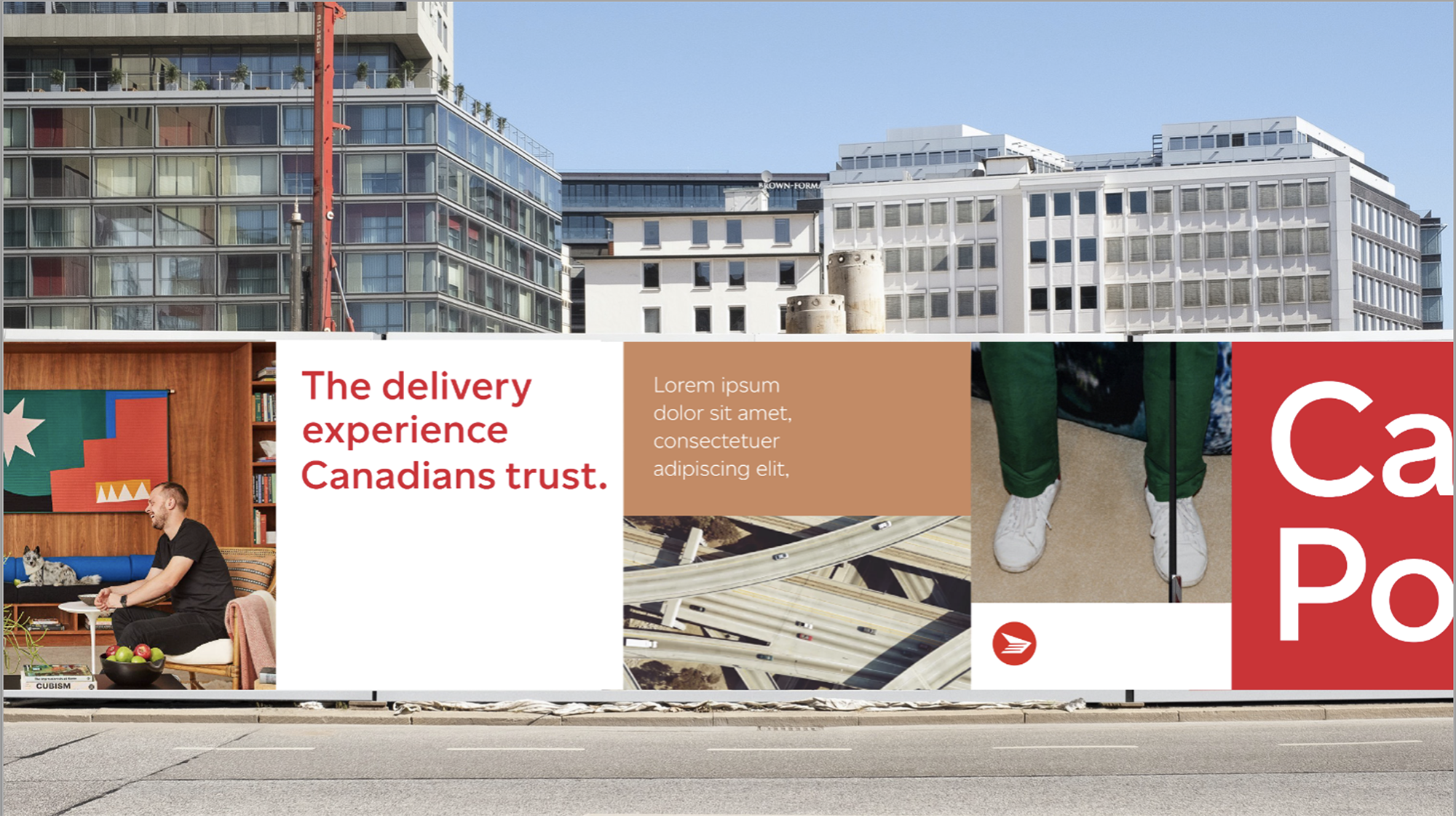
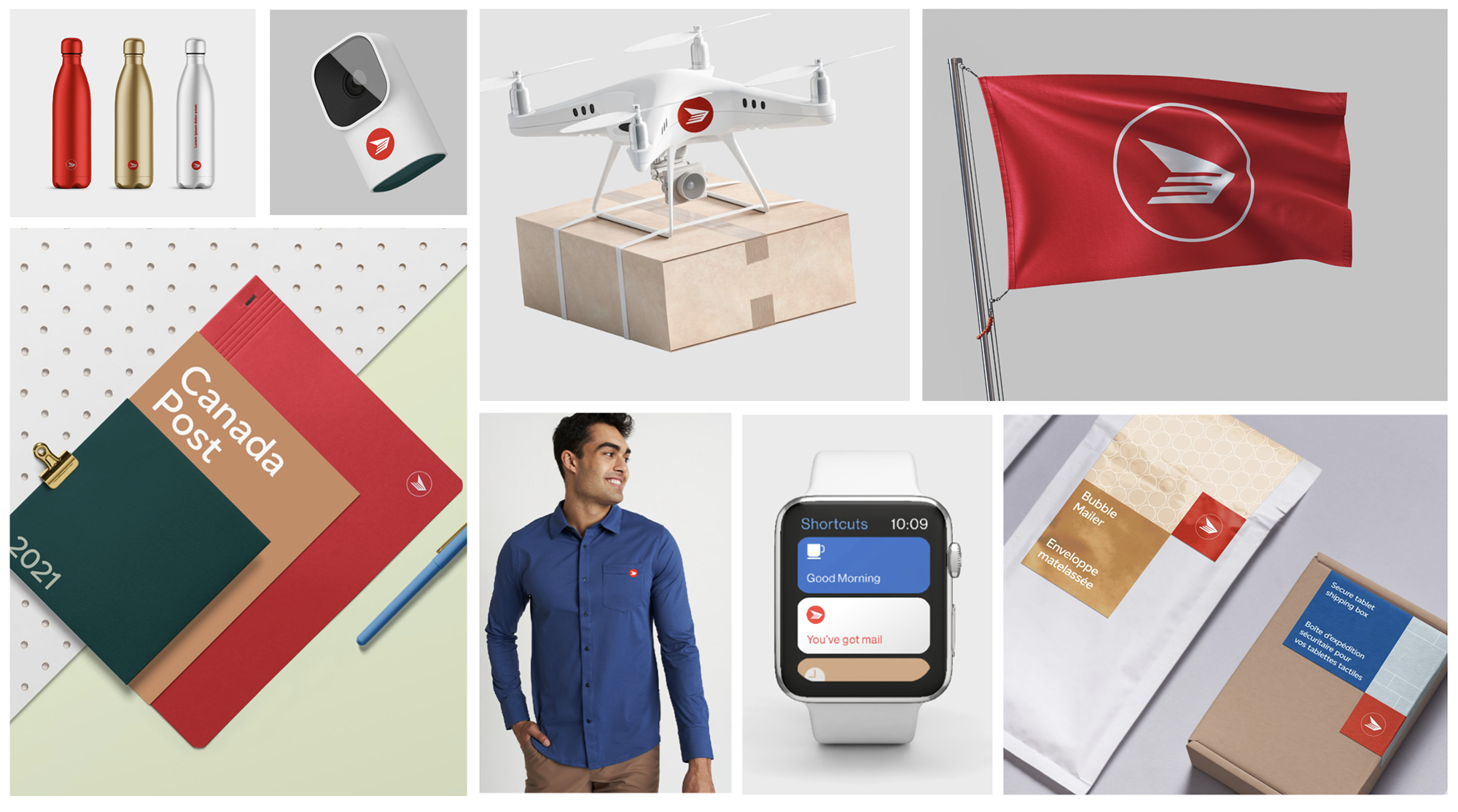
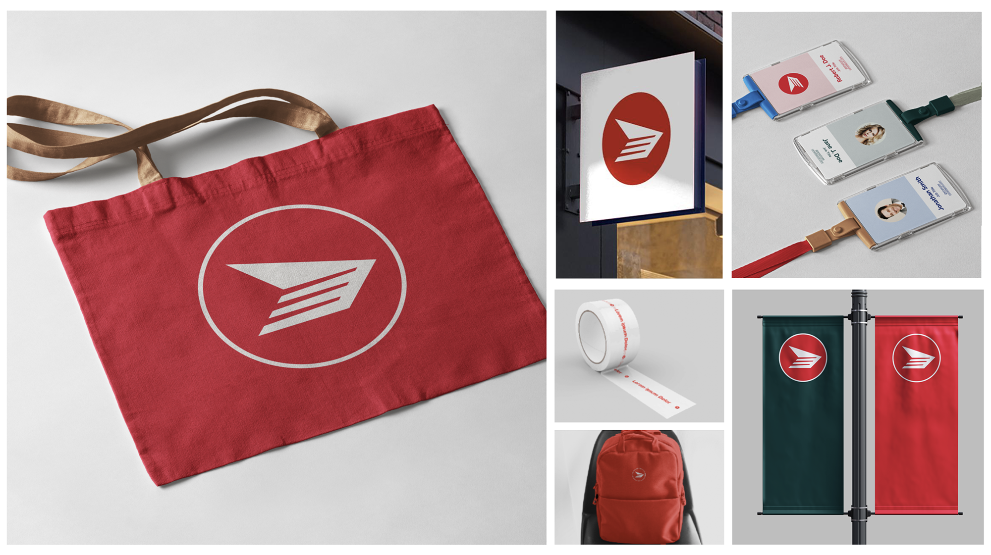
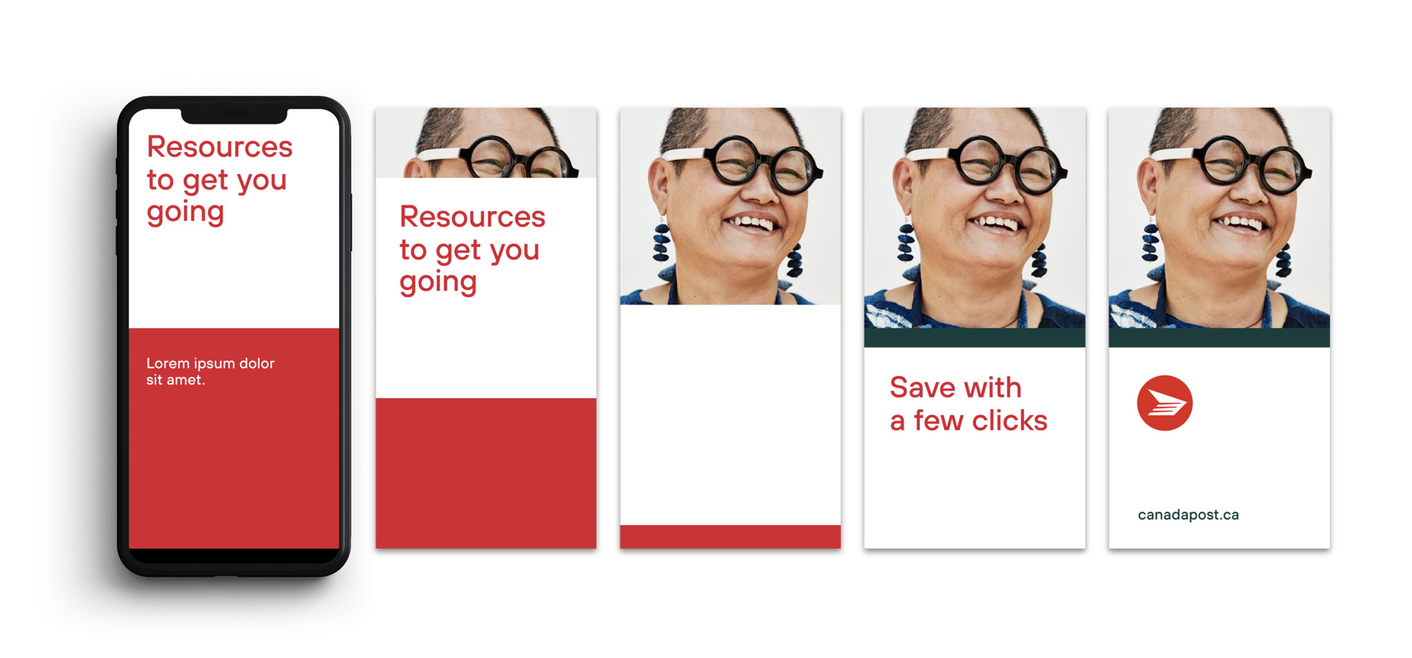
Print and beyond
The system was built to work everywhere.
Whether it’s print, video, or social, the visual language adapts naturally without losing consistency. That flexibility helps strengthen the brand across channels and makes it easier for teams to apply it in real situations.