Support Our Troops
Situation
Support Our Troops needed a visual identity that clearly represented the full scope of its program, serving active service members, veterans, and military families. The goal was to create a symbol that was instantly recognizable and meaningful to Canadians.
The Challenge
The challenge was translating a deeply human mission into a simple, enduring mark. The identity had to communicate support and unity without being overly literal or complex. It also needed to balance representation across the Army, Air Force, Navy, and families, ensuring clarity and respect across multiple applications.
What Was Done
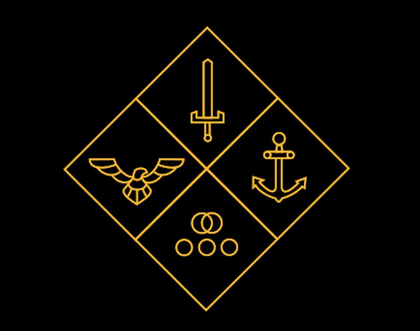
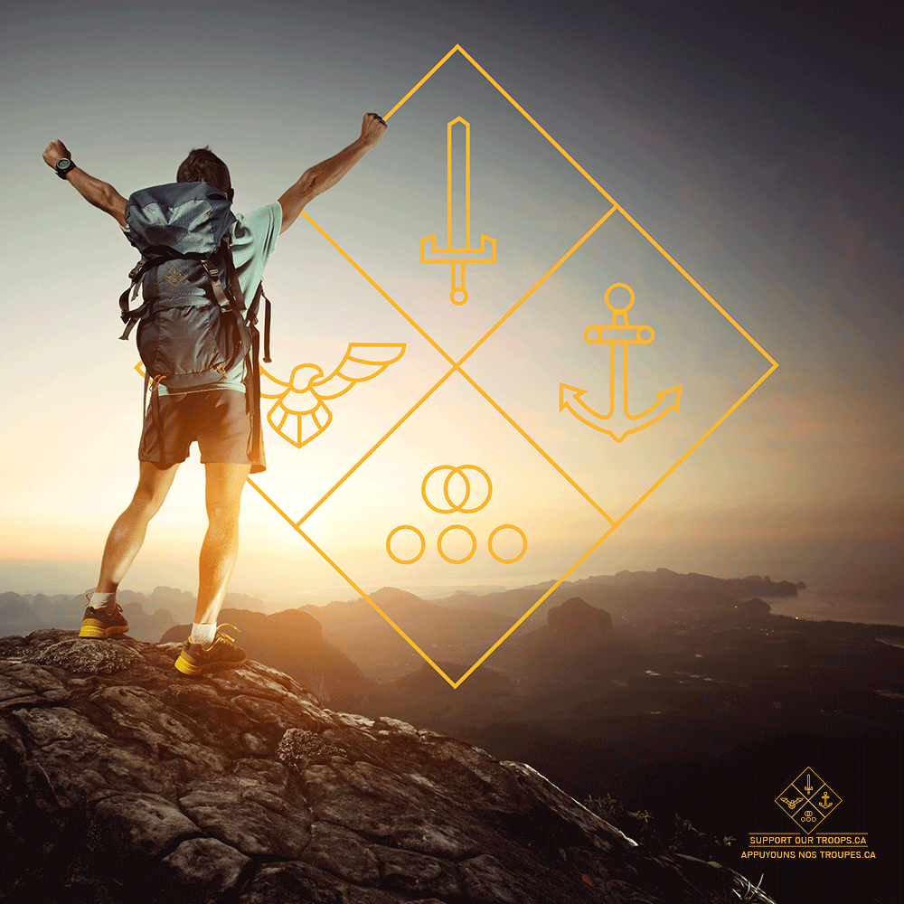
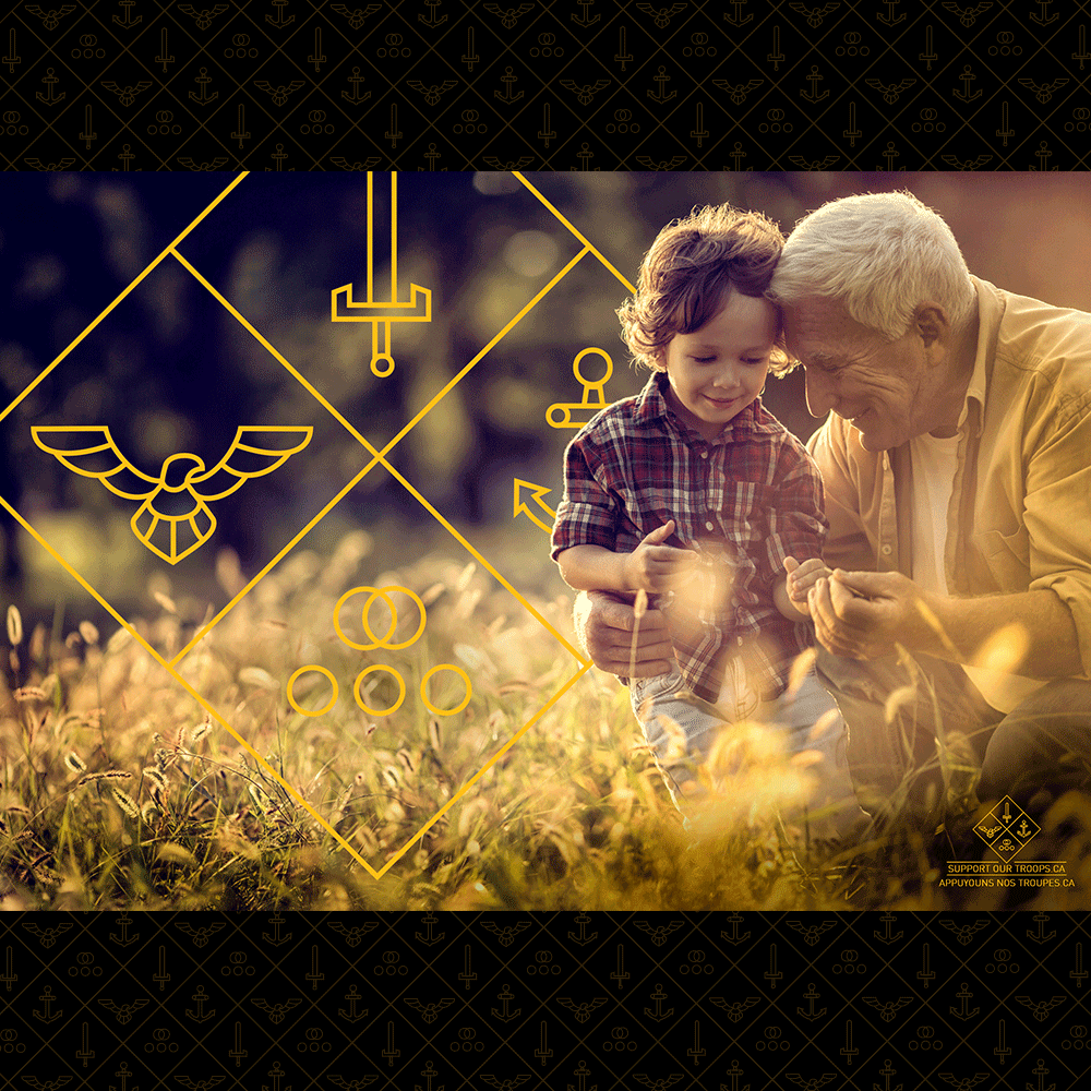
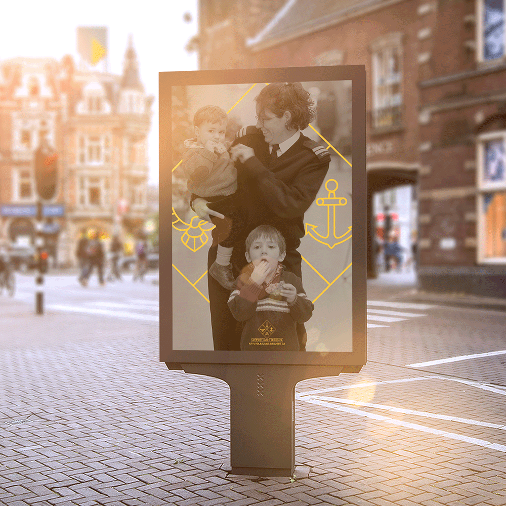
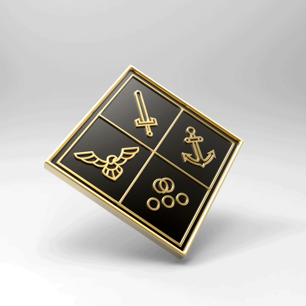
I developed a focused identity built around a single geometric mark: a diamond divided into four quadrants representing the service branches and families. This created a clear, balanced system that communicates unity and shared strength. The design works consistently across print, digital, and live applications, providing a cohesive identity that supports the program’s emotional and practical impact.
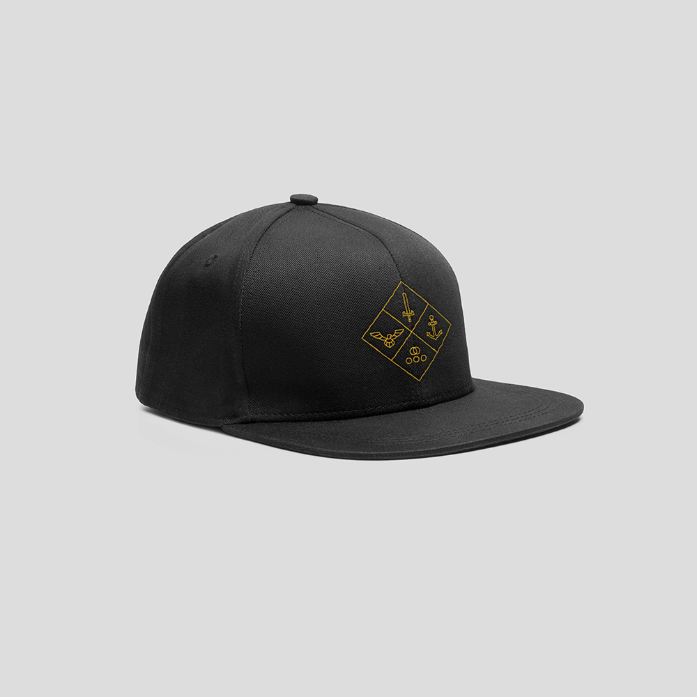
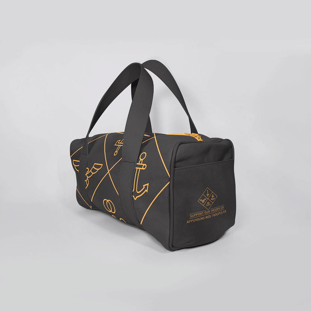
The logo distills the Support Our Troops identity into a single geometric symbol, a diamond divided into four precise, line-drawn quadrants.
The top three quadrants honor the Army, Air Force and Navy through minimal, iconic illustrations. Anchoring the composition, the lower quadrant represents the military family, quietly powerful and structurally essential.
Together, the four elements form a balanced system that communicates unity, support, and shared strength.